HOUSE ON THE GREAT WALL


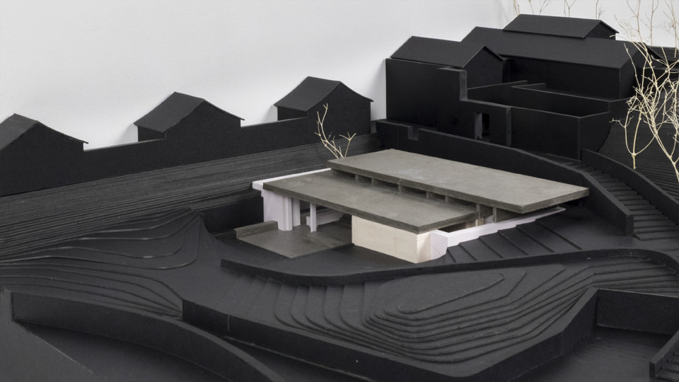
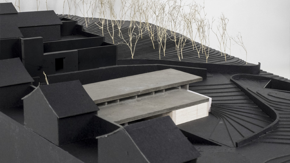


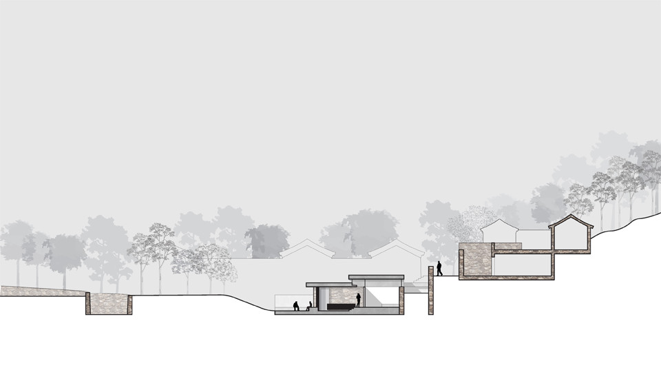
RESIDENTIAL | 2019 | BEIJING | CHINA
C10 TOWER

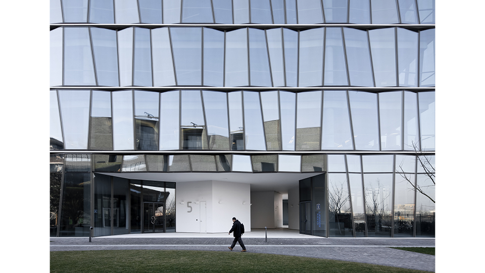


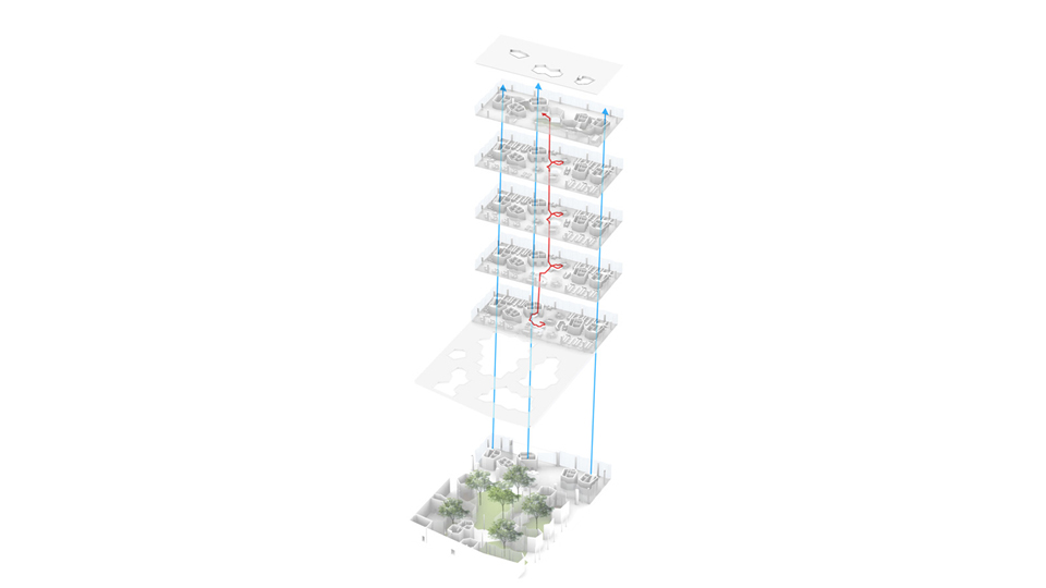

OFFICE | 2016 | SHANGHAI | CHINA | In collaboration with ZAO/Standardarchitecture
WILDCHINA SONGYANG


MULTIFUNCTION | 2021 | SONGYANG | CHINA
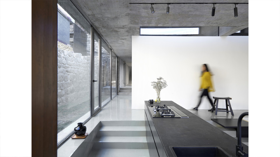
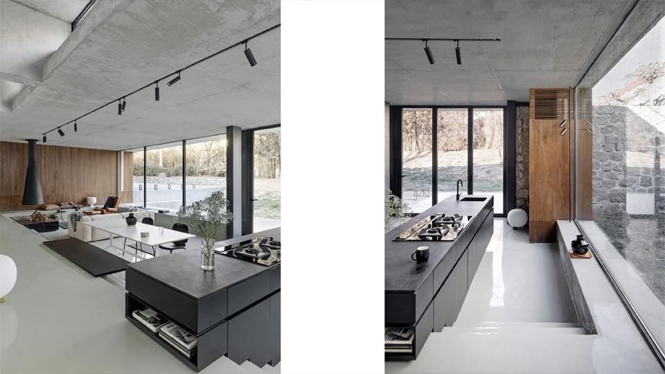
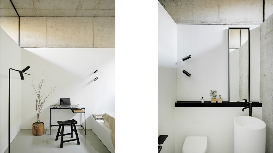
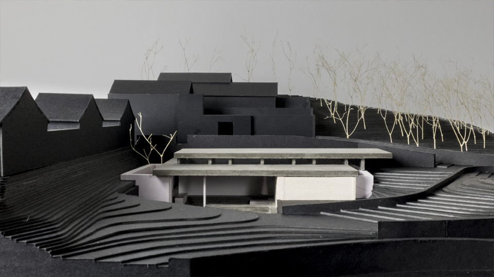
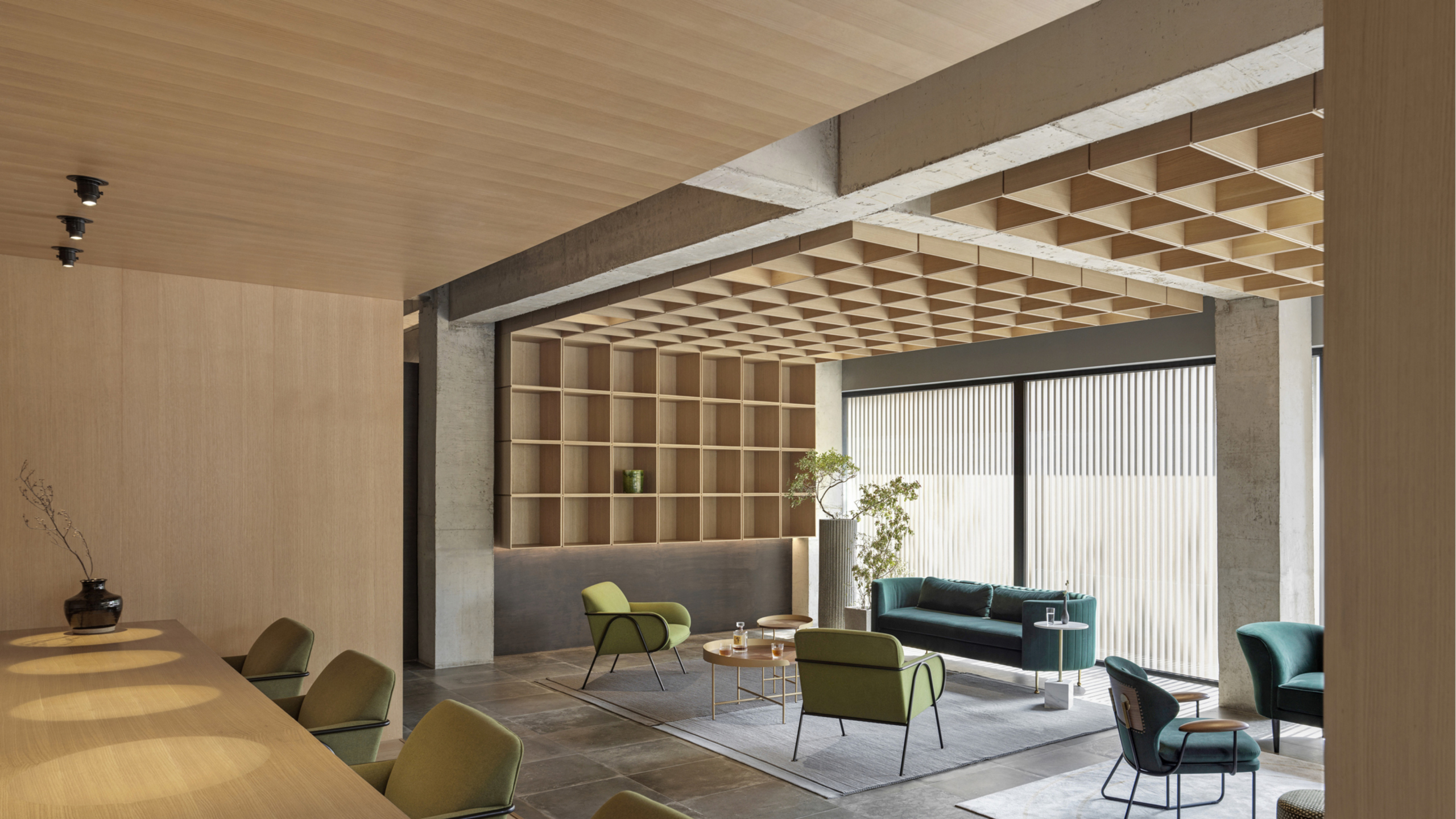
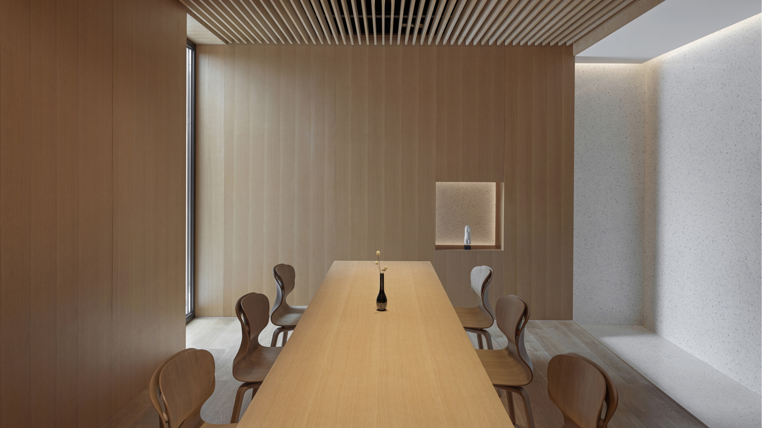
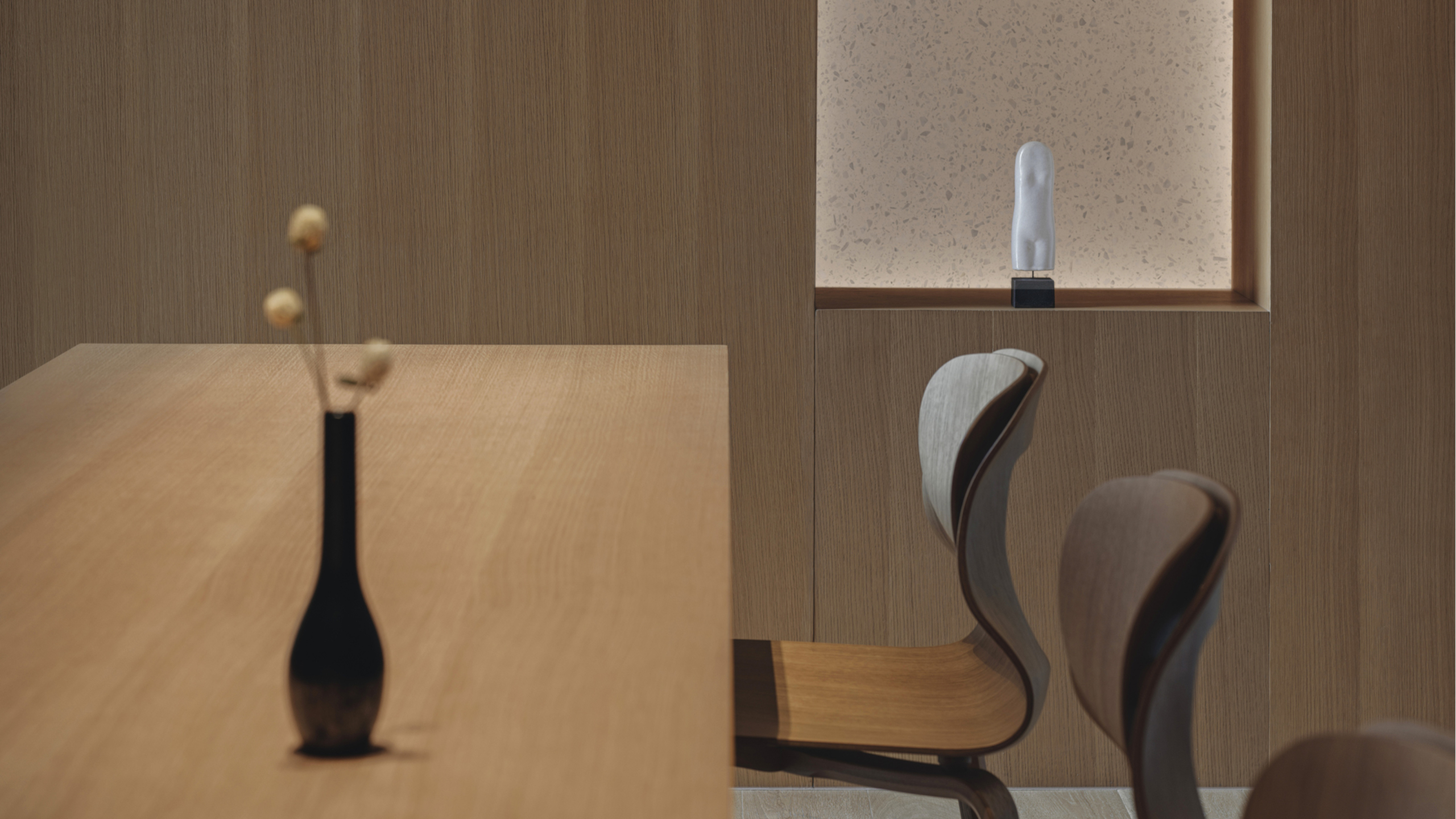
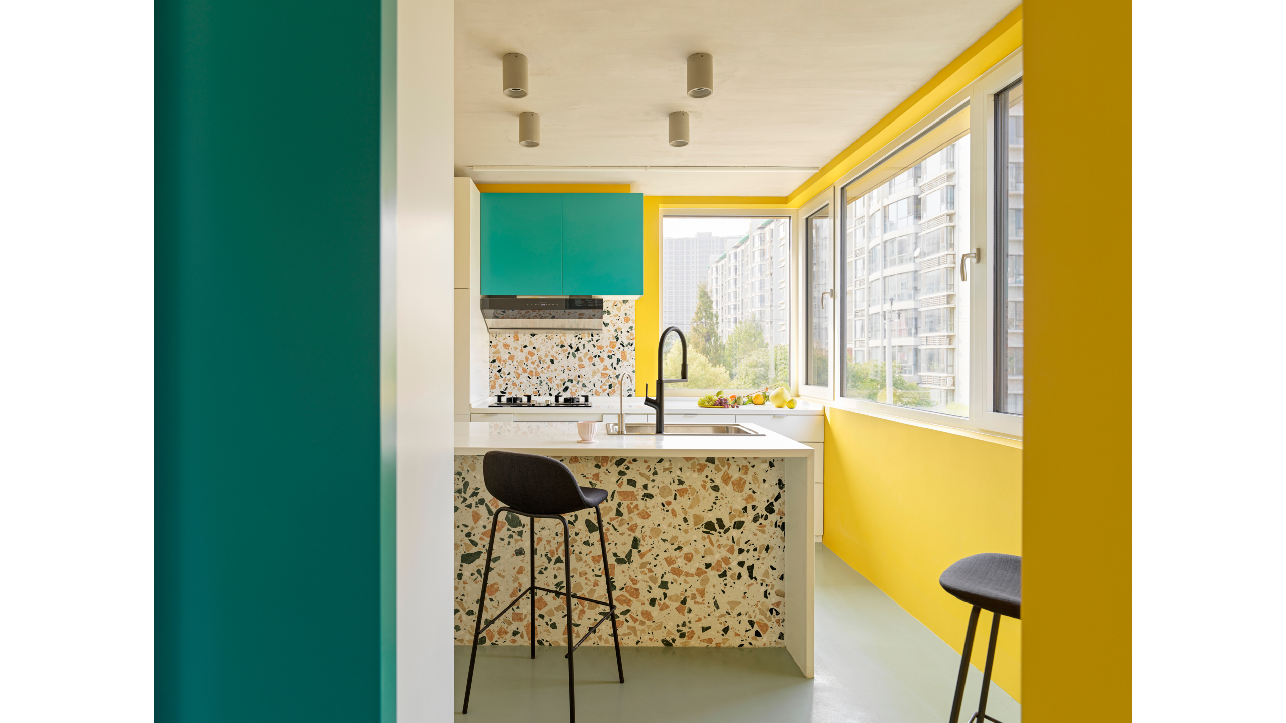
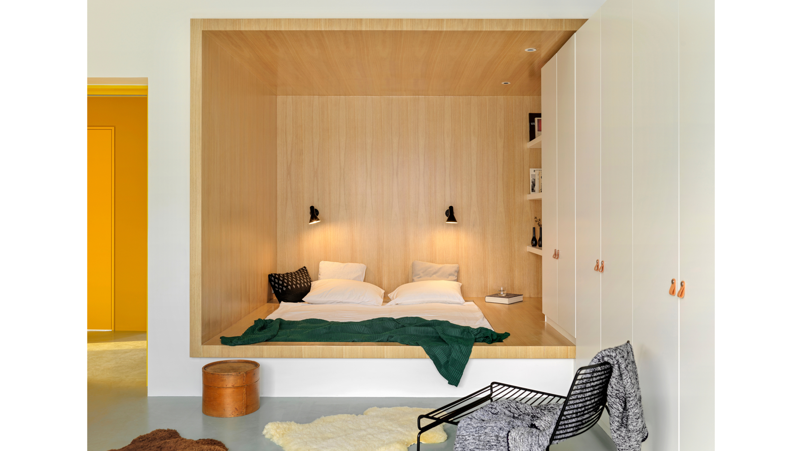
HOUSE HD
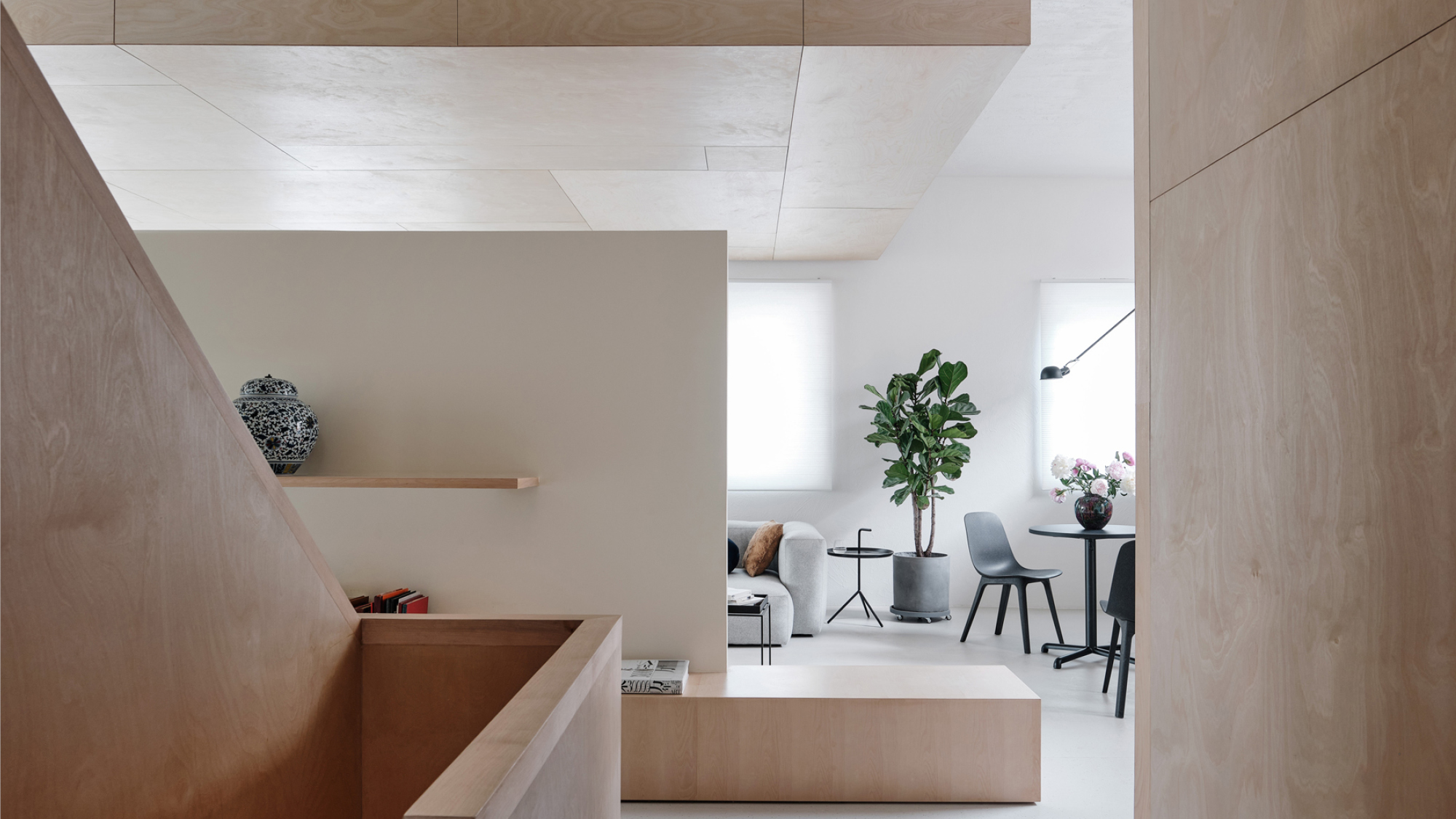


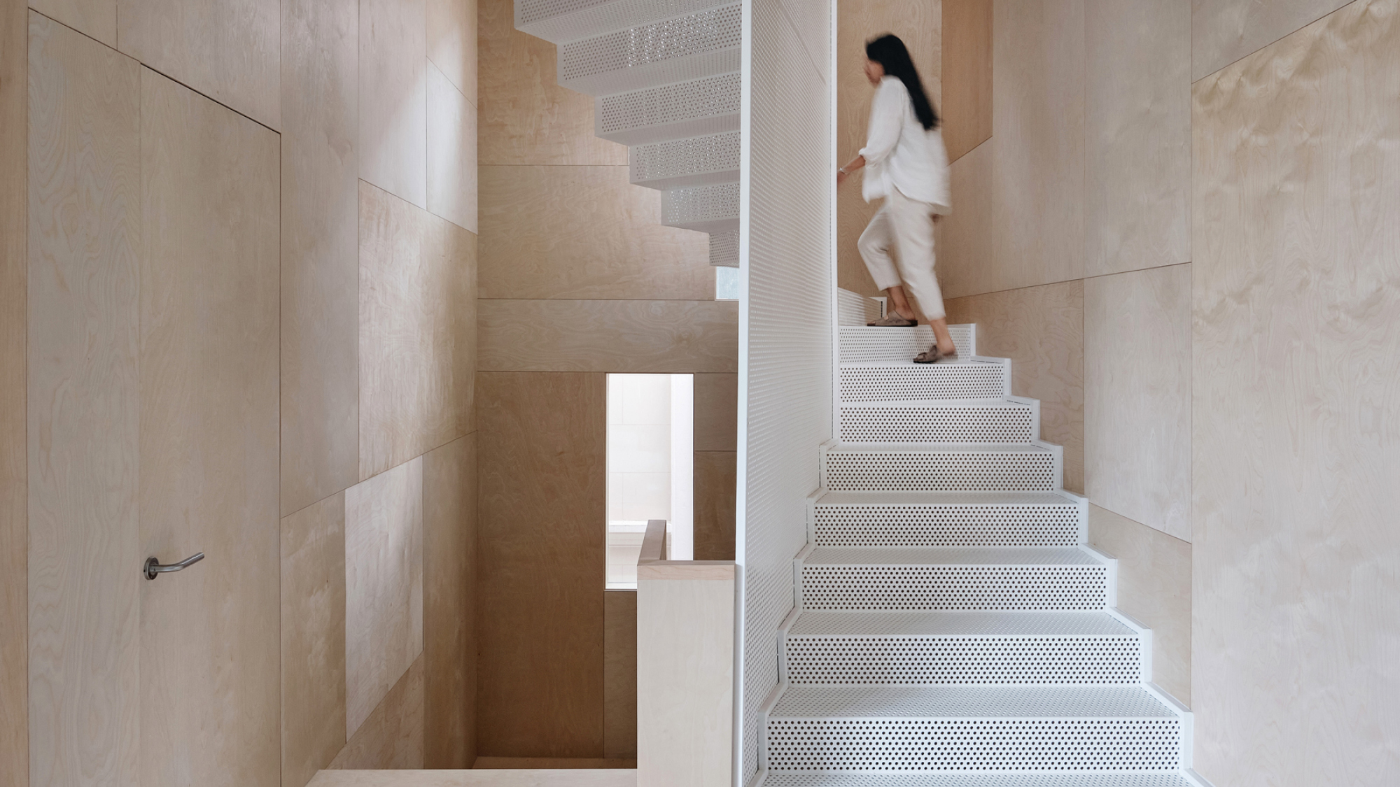


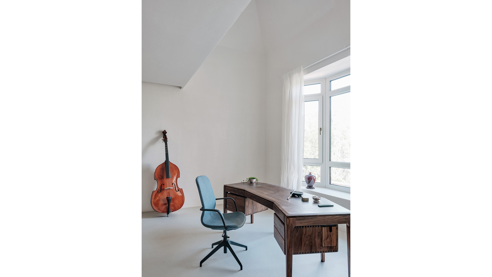
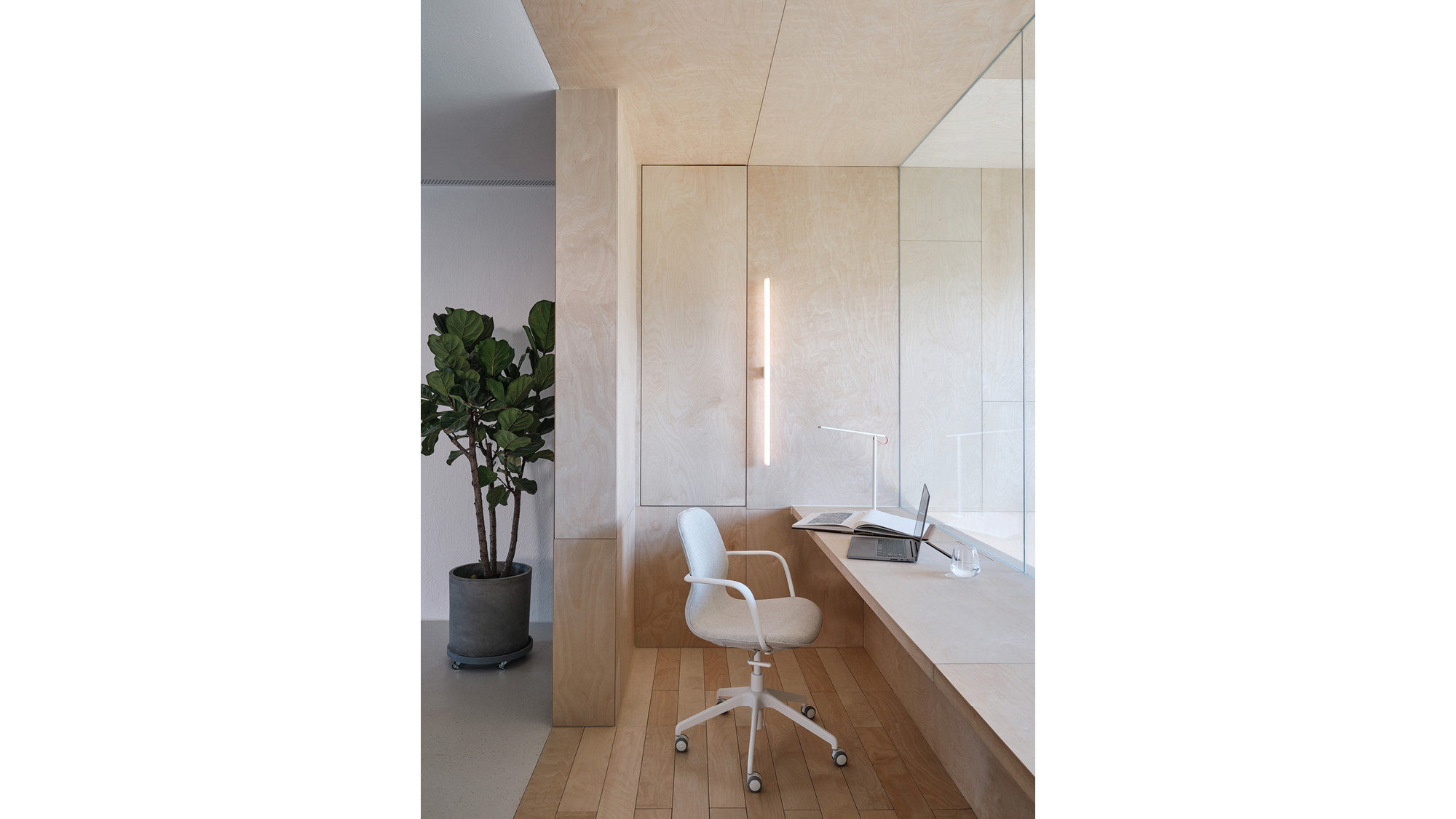


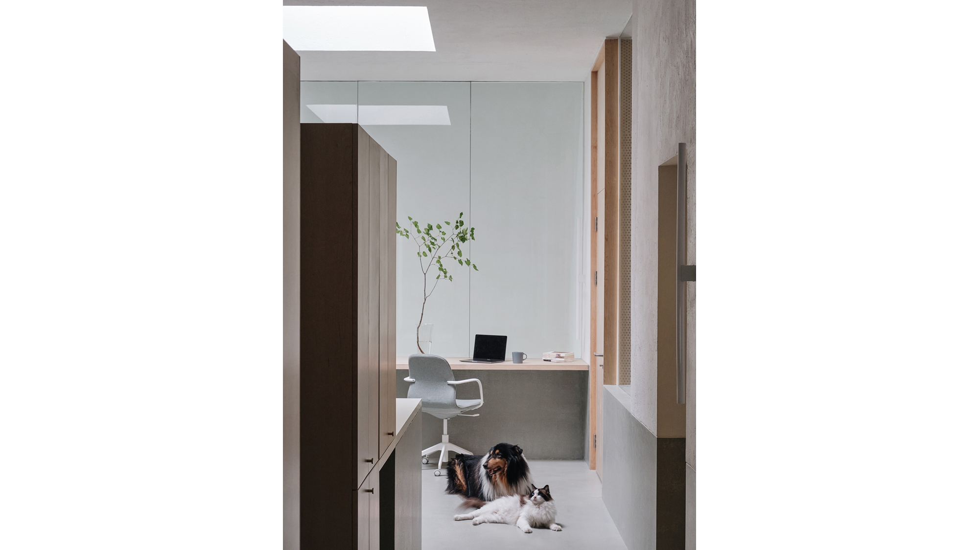

RESIDENTIAL | 2020 | BEIJING | CHINA
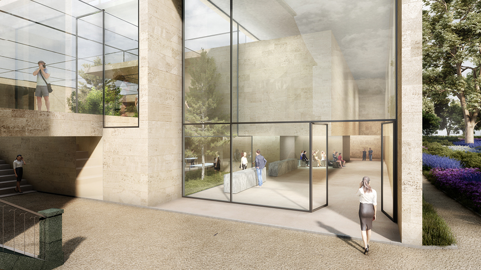
MALI SQUARE


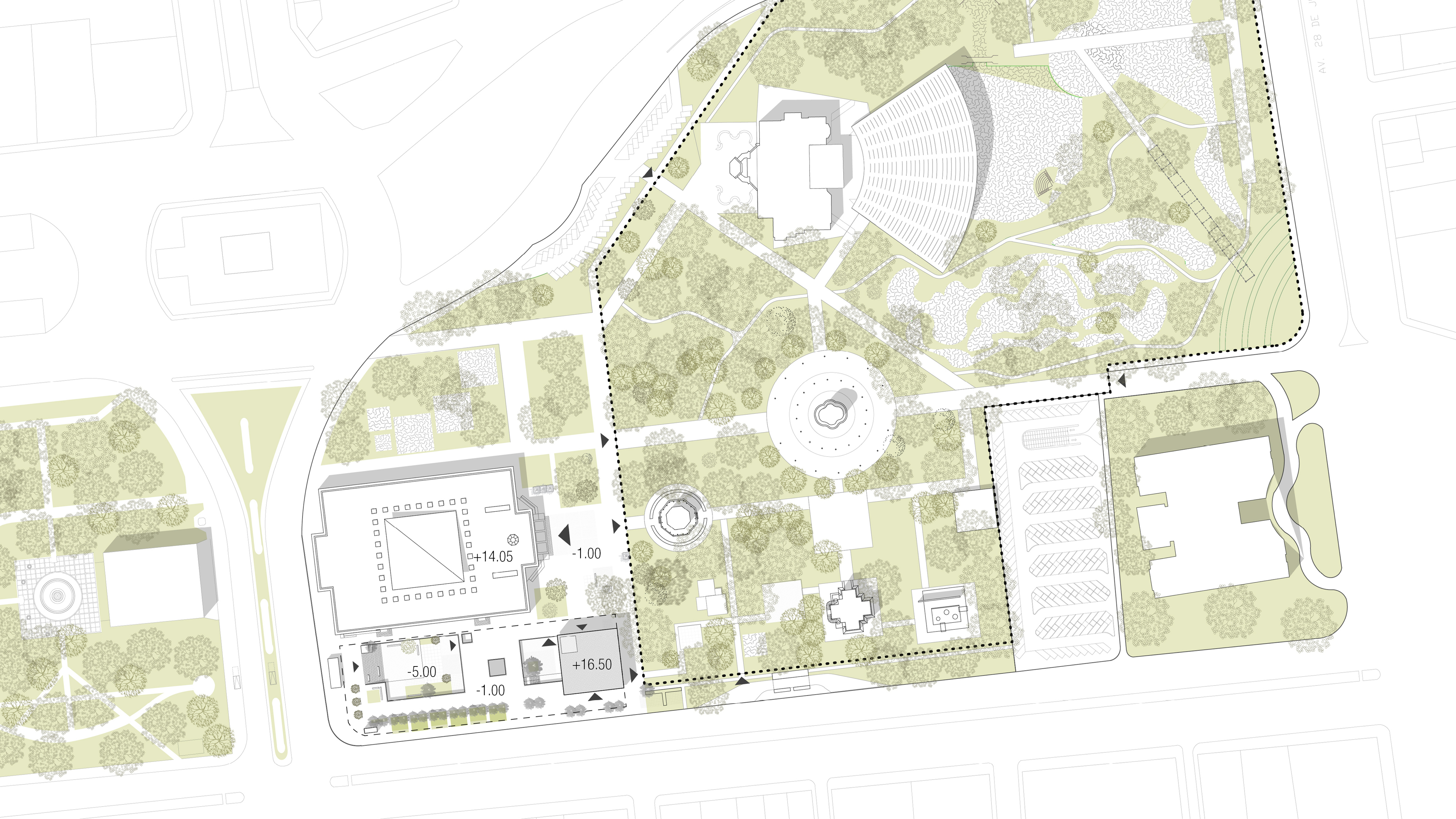


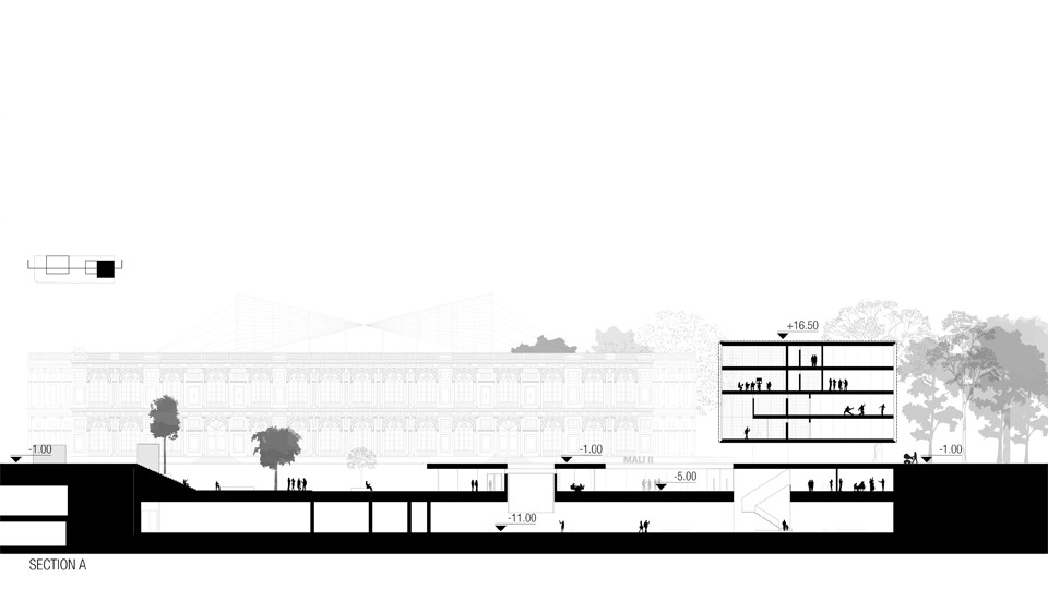


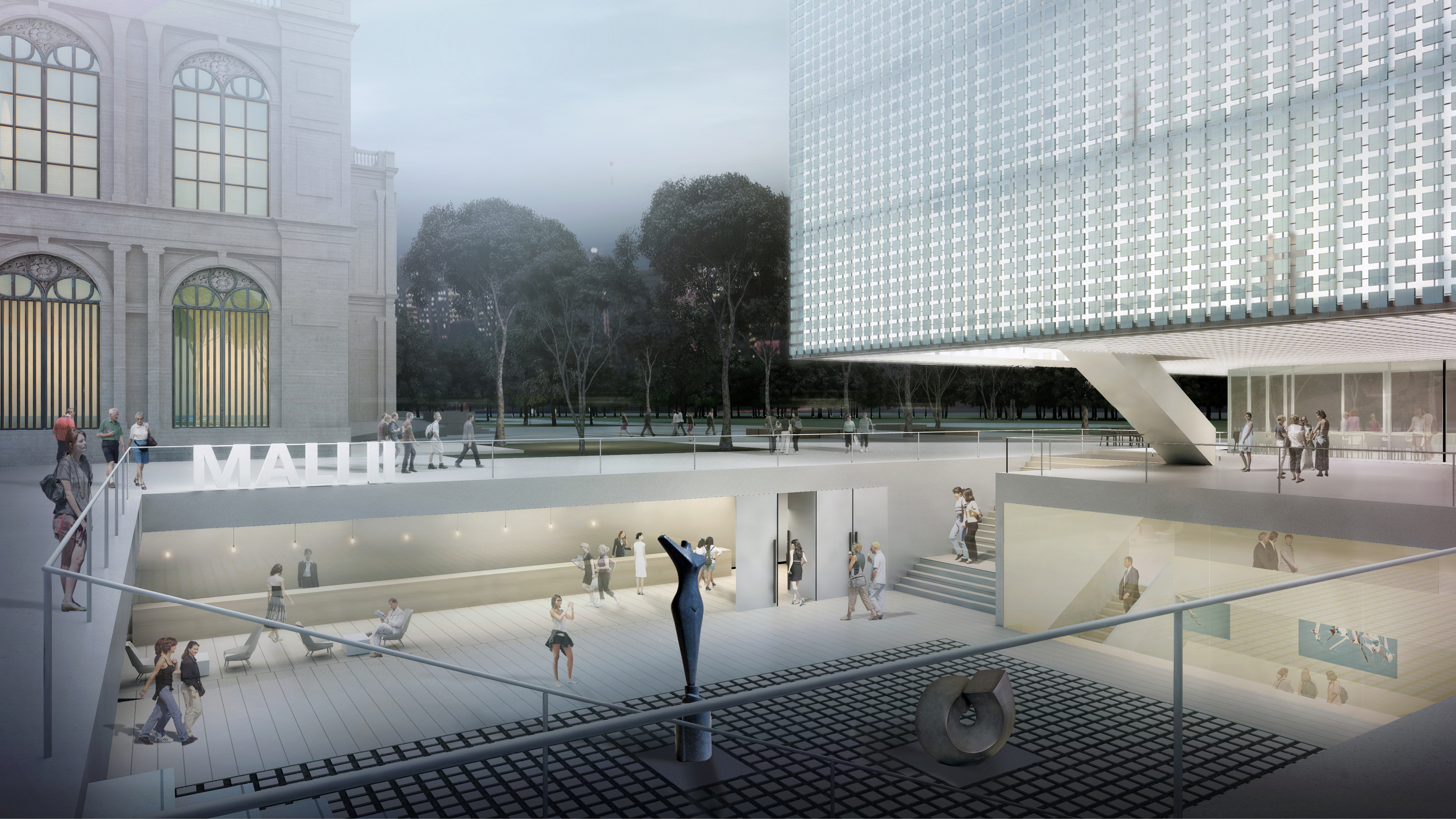
NEW CONTEMPORARY ART WING FOR MALI MUSEUM I HONORABLE MENTION | 2016 | LIMA | PERU
NENGXIN

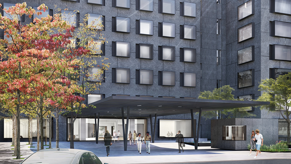


OFFICE BUILDING | 2018 | BEIJING | CHINA
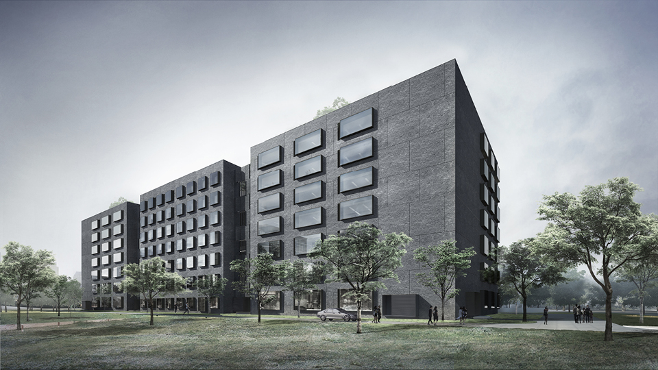
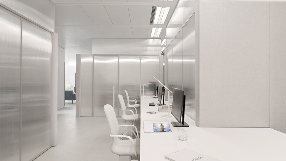
CWITM


OFFICE | 2018 | BEIJING | CHINA
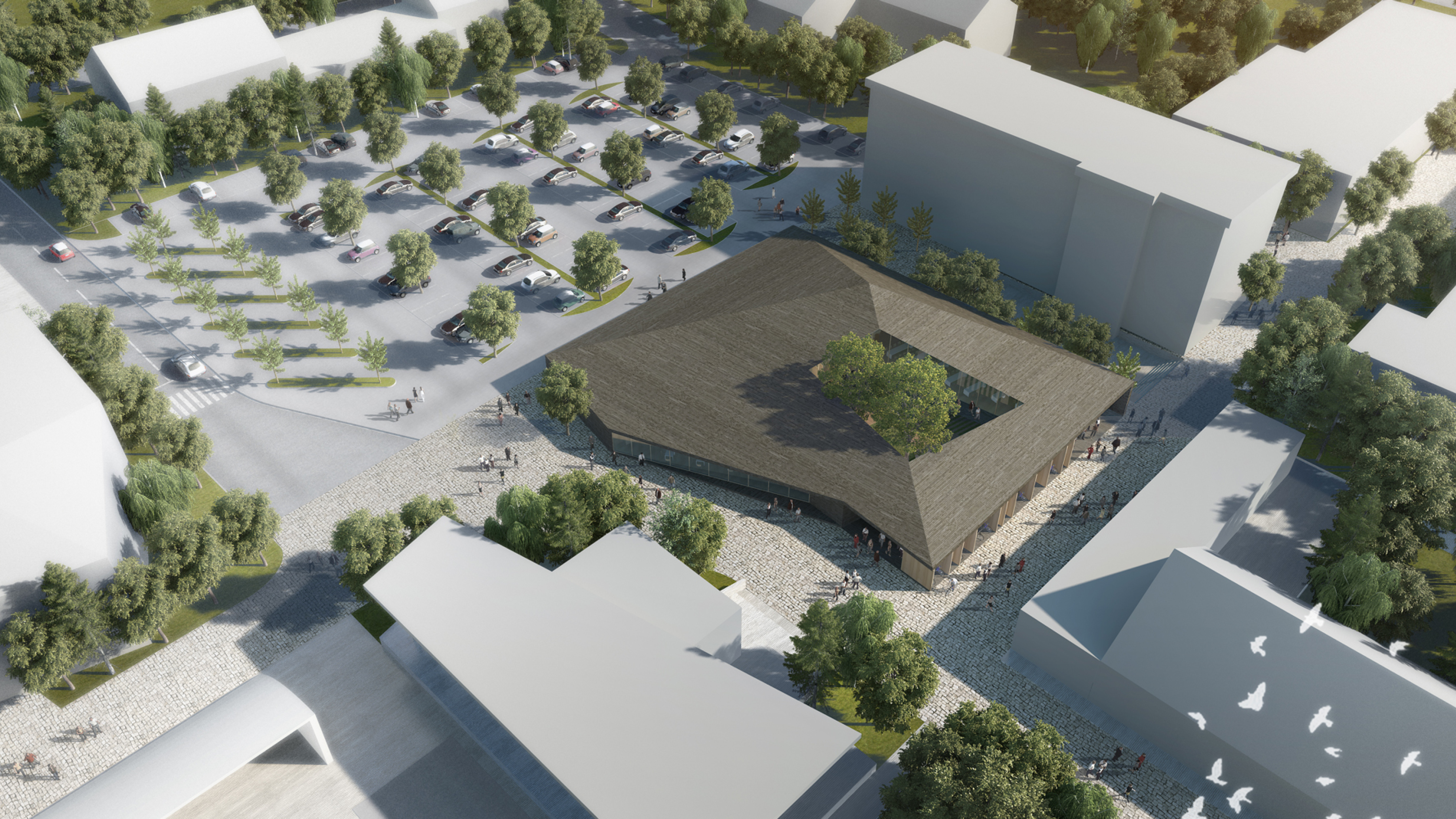
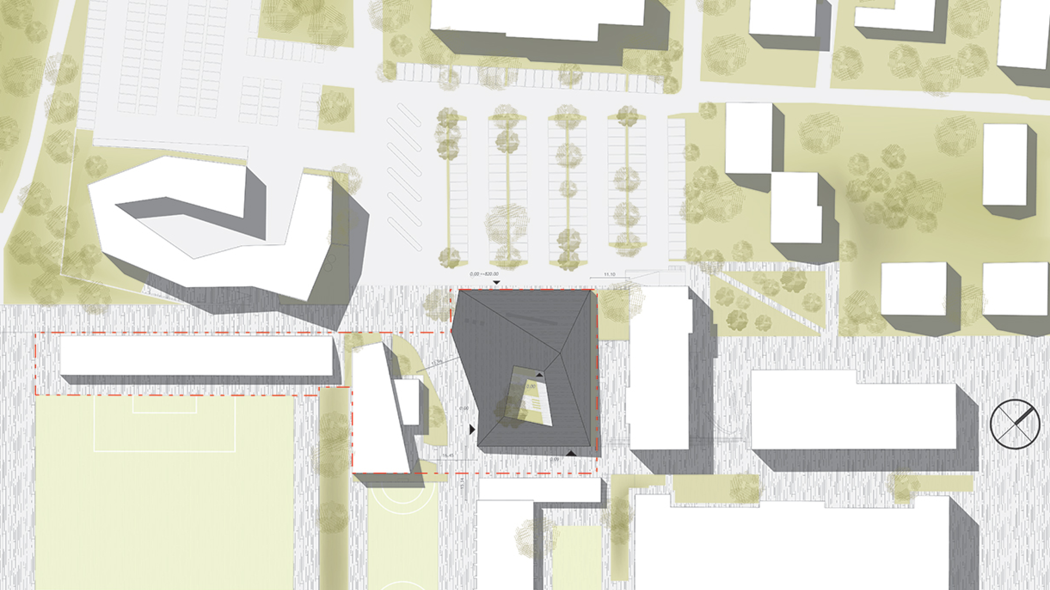
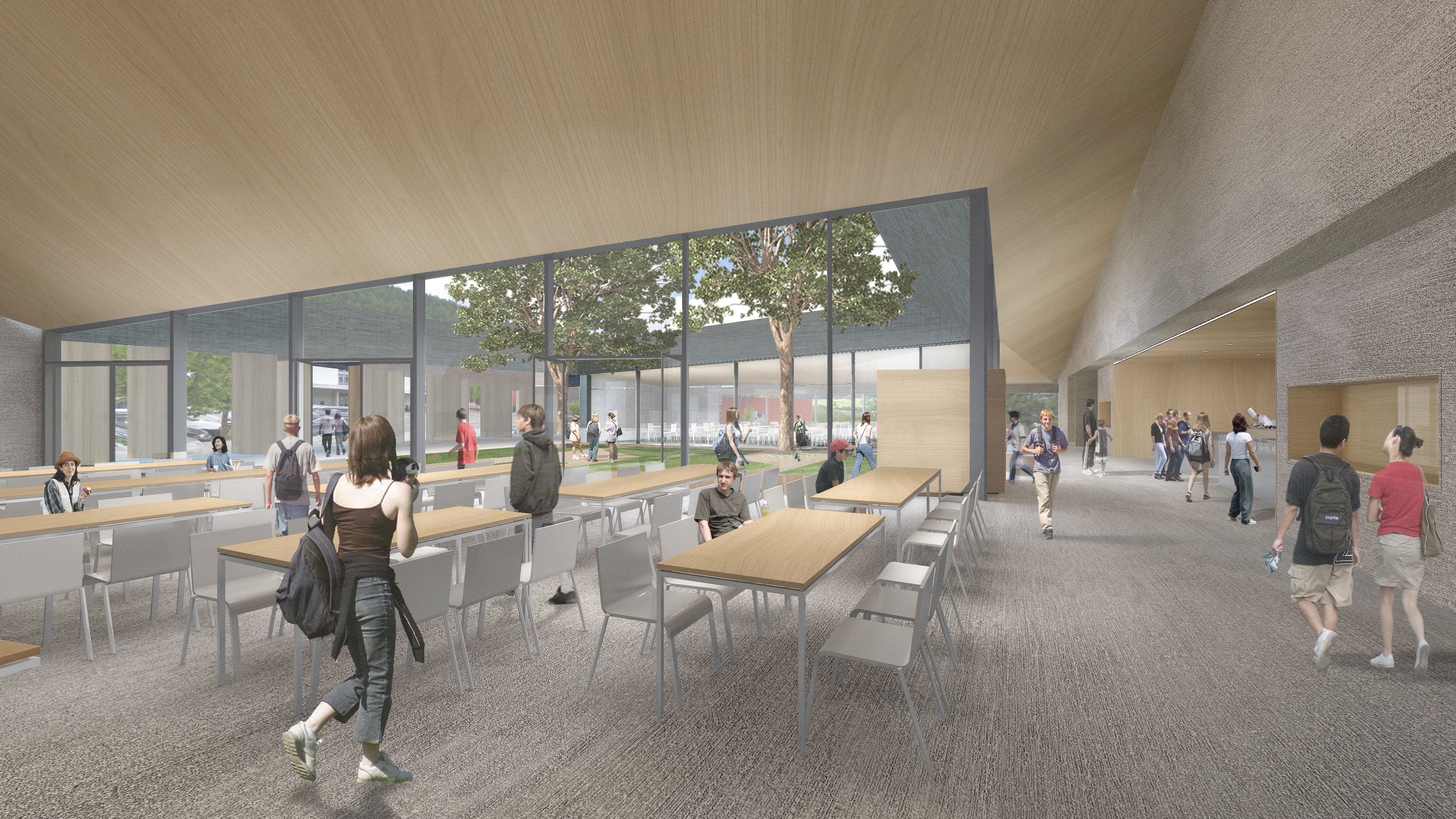
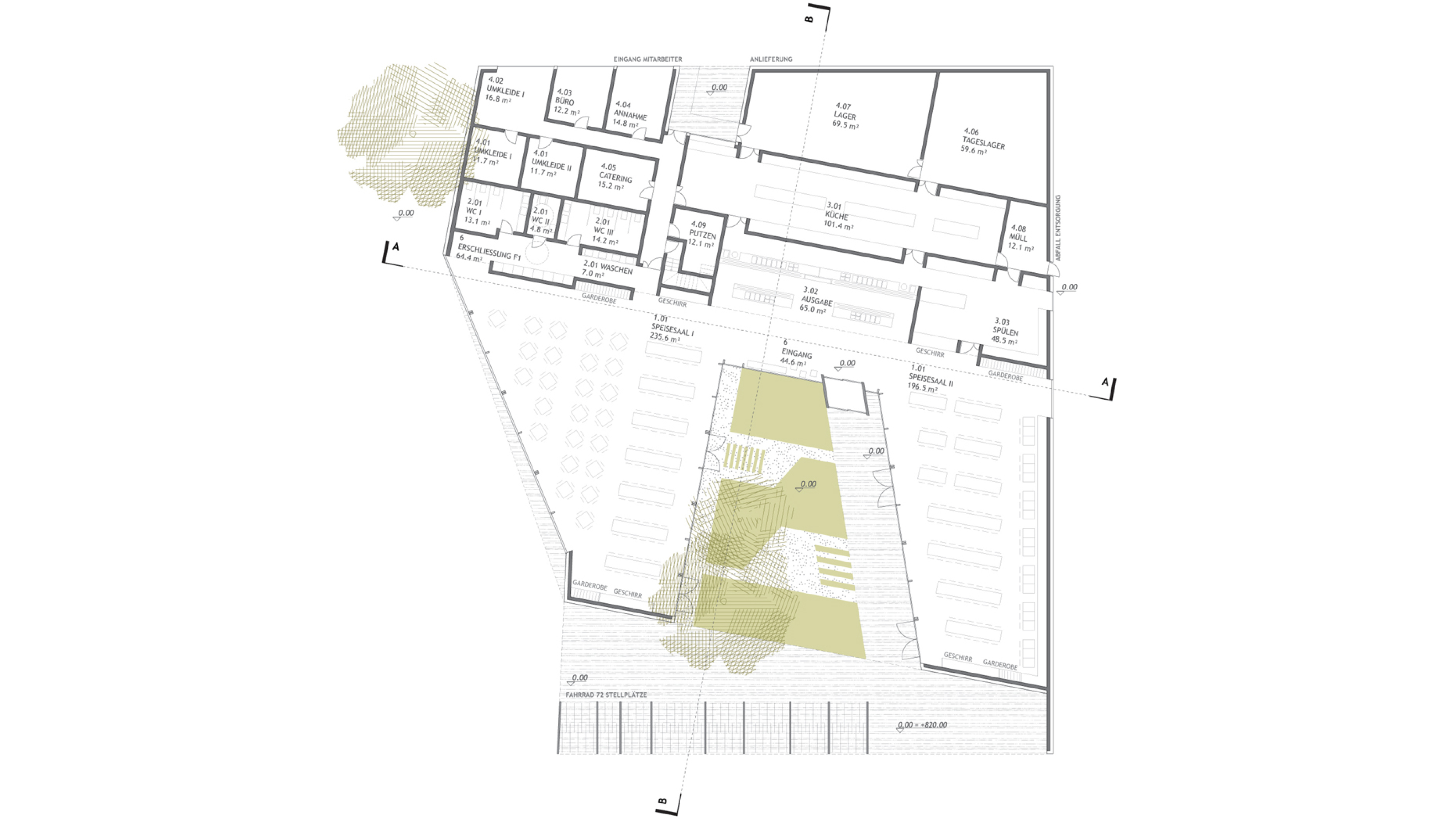
VISITOR CENTER UNESCO GEOPARK BAD MUSKAU


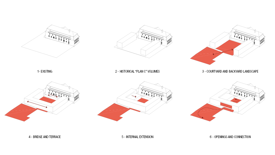

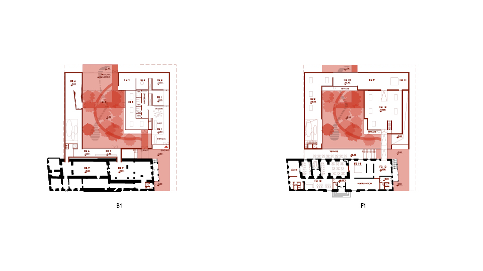
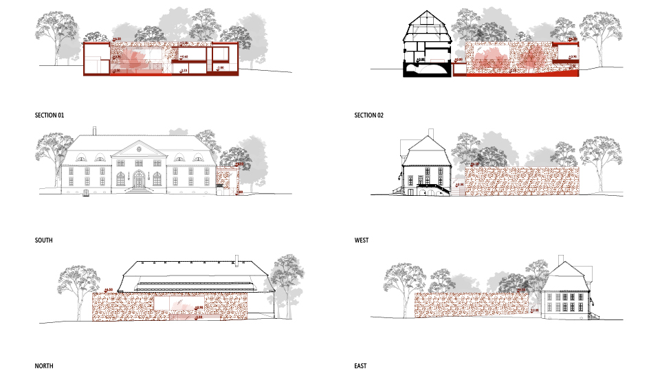
COMPETITION | 2021 | BAD MUSKAU | GERMANY
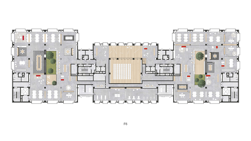
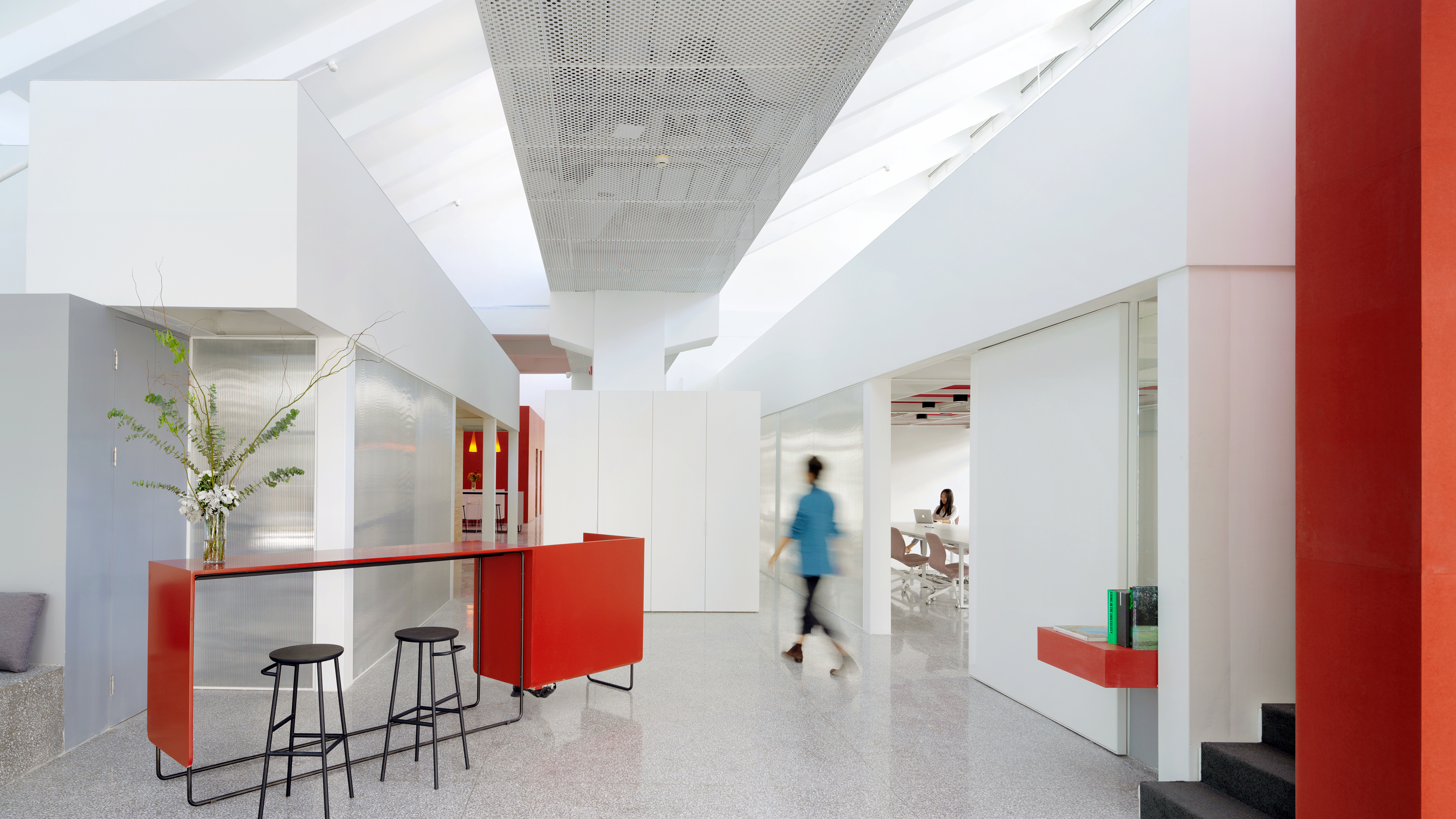
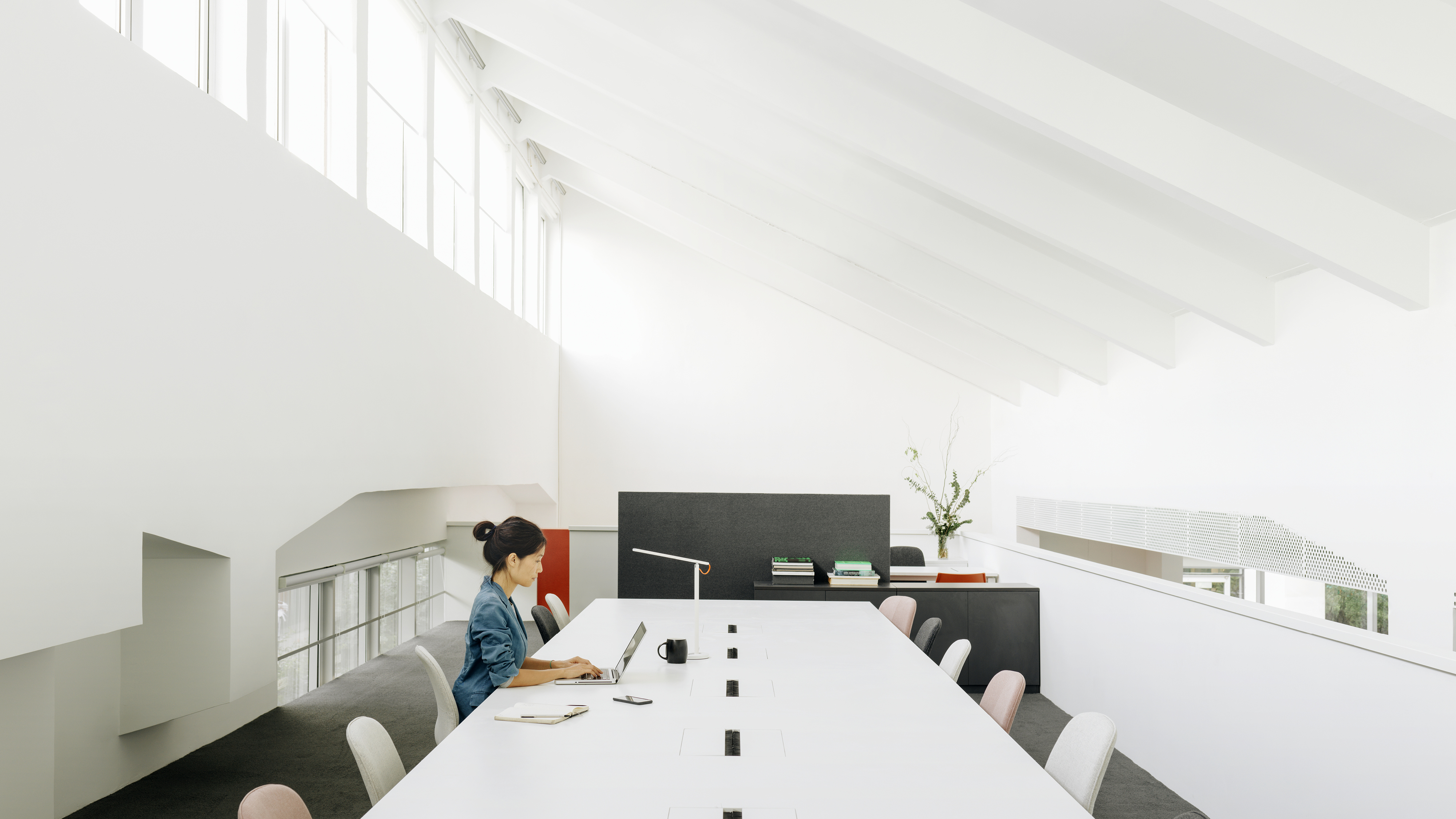
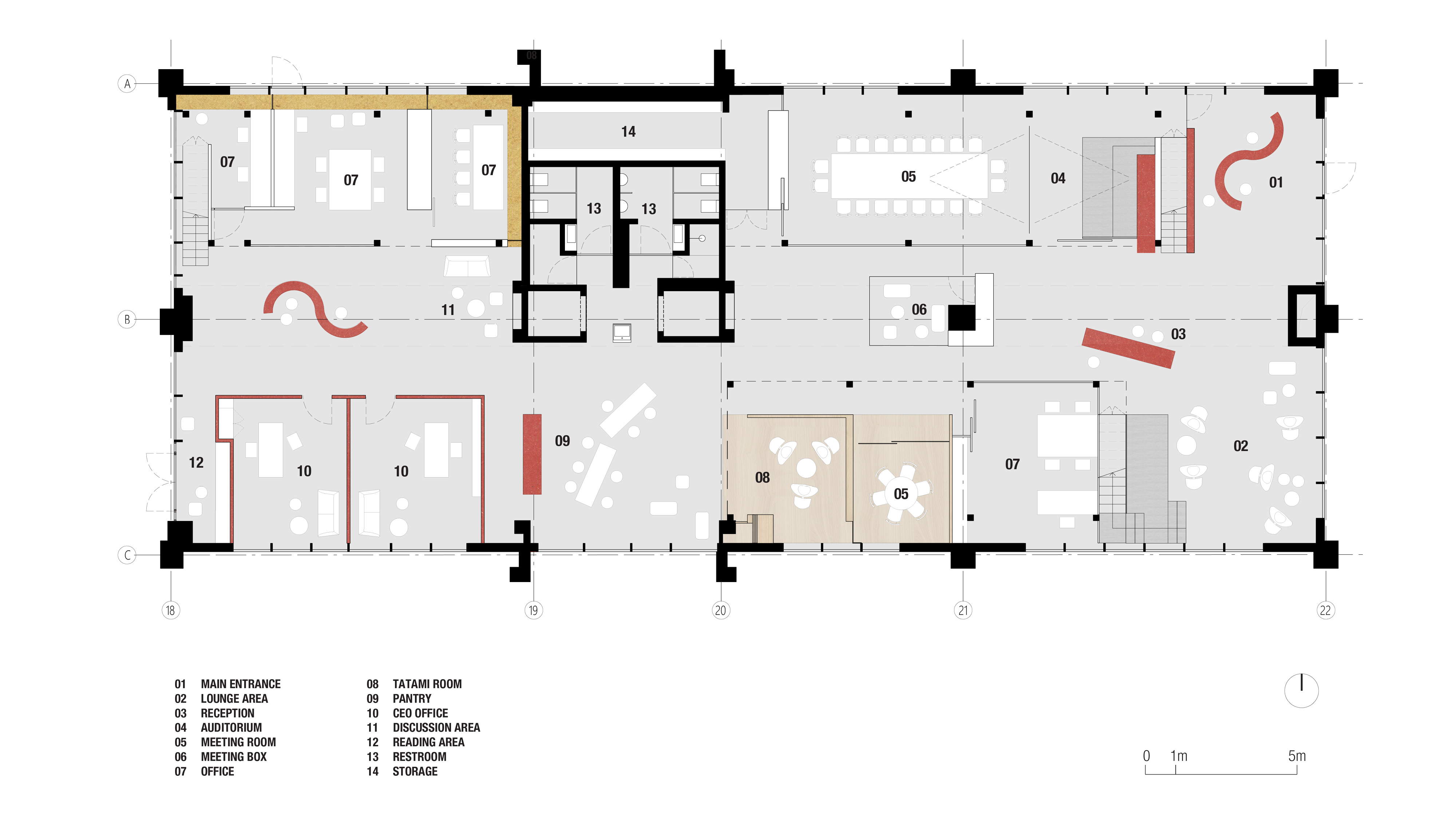
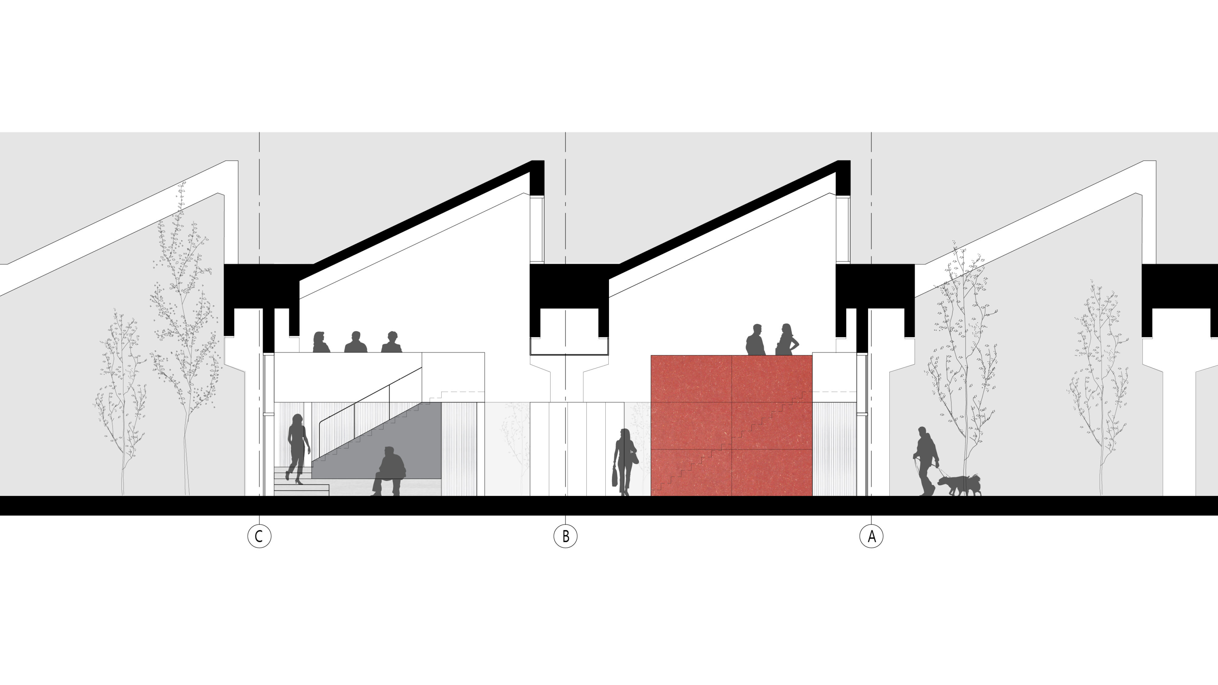
UNIVERSAL MUSIC PUBLISHING GROUP BEIJING
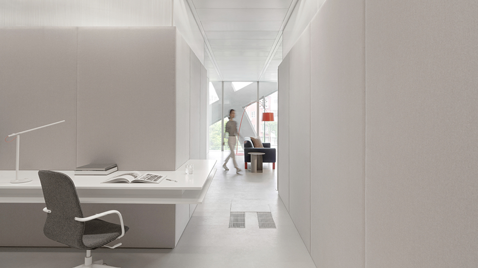


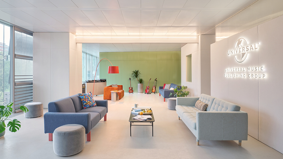


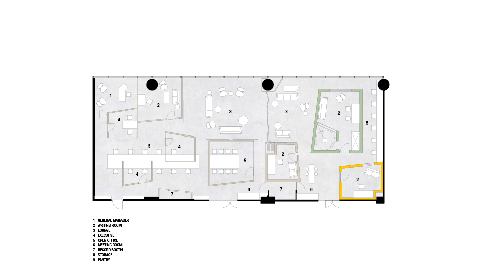
OFFICE | 2020 | BEIJING | CHINA
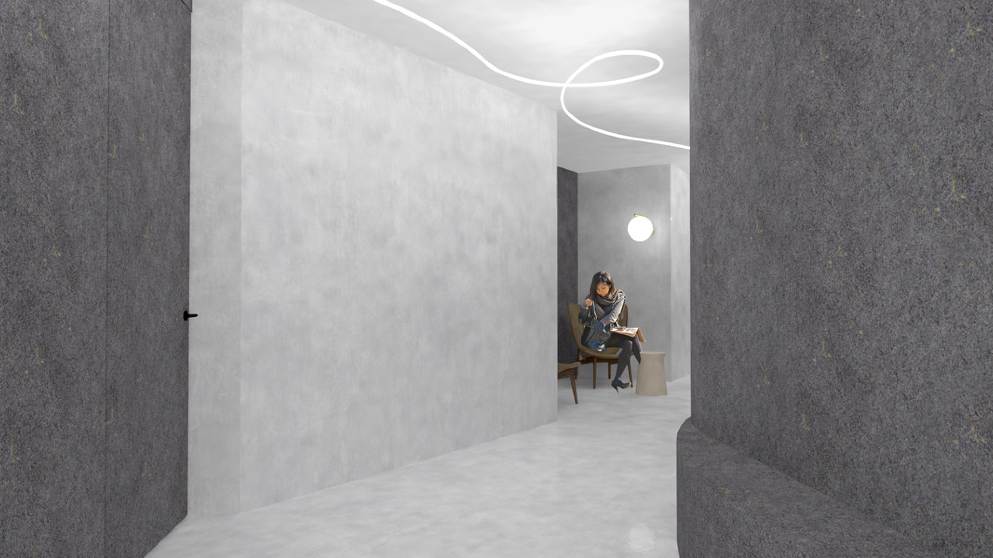
THE CORNER


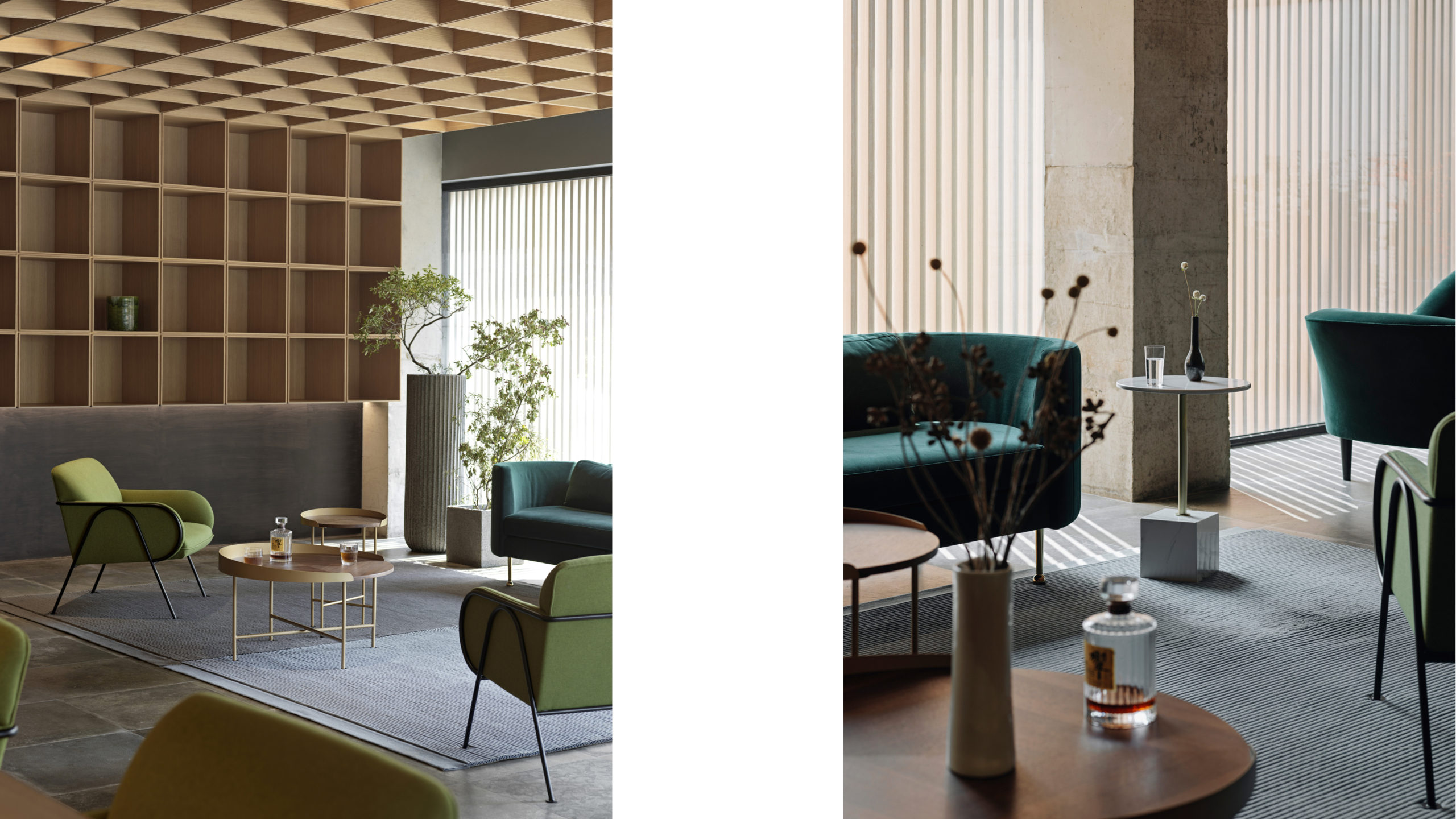
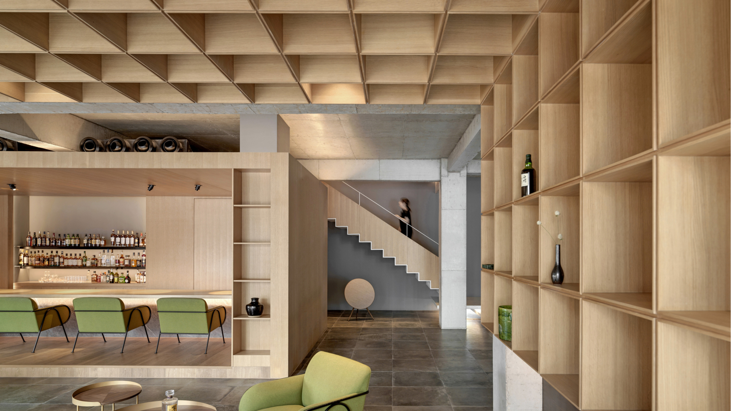
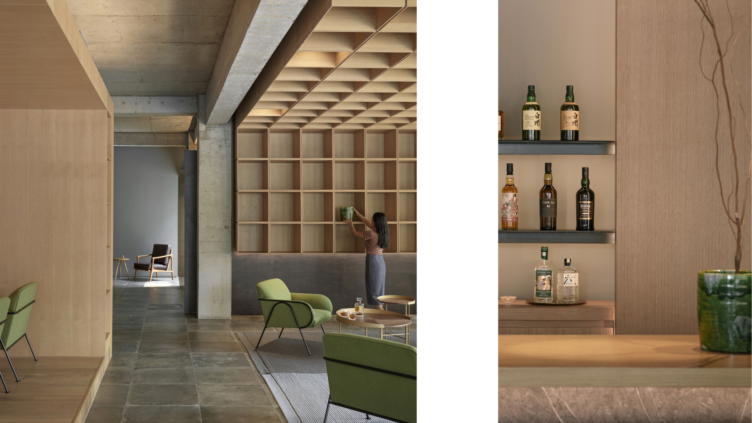


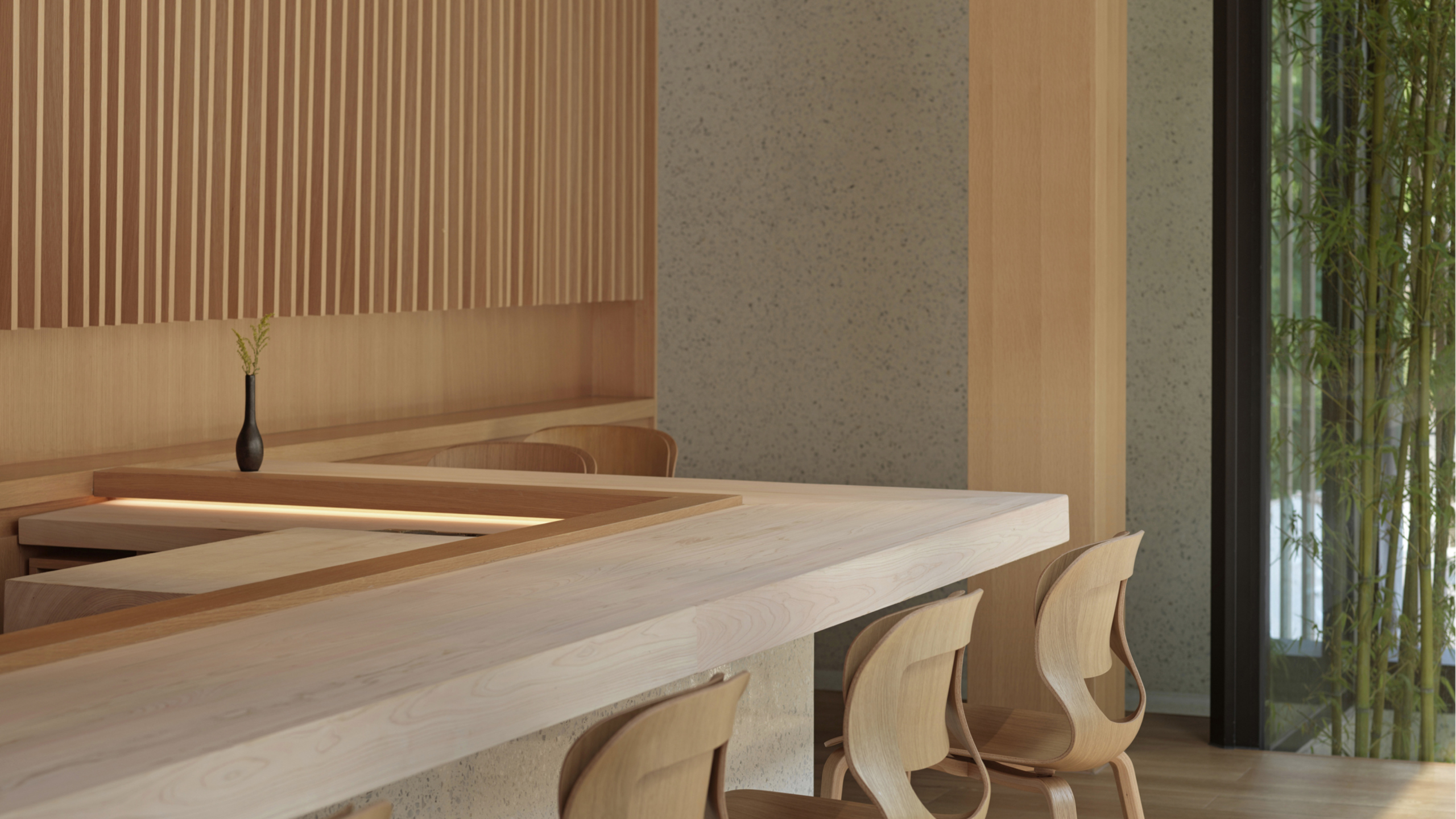


RESTAURANT & BAR | 2019 | BEIJING | CHINA
HOUSE P

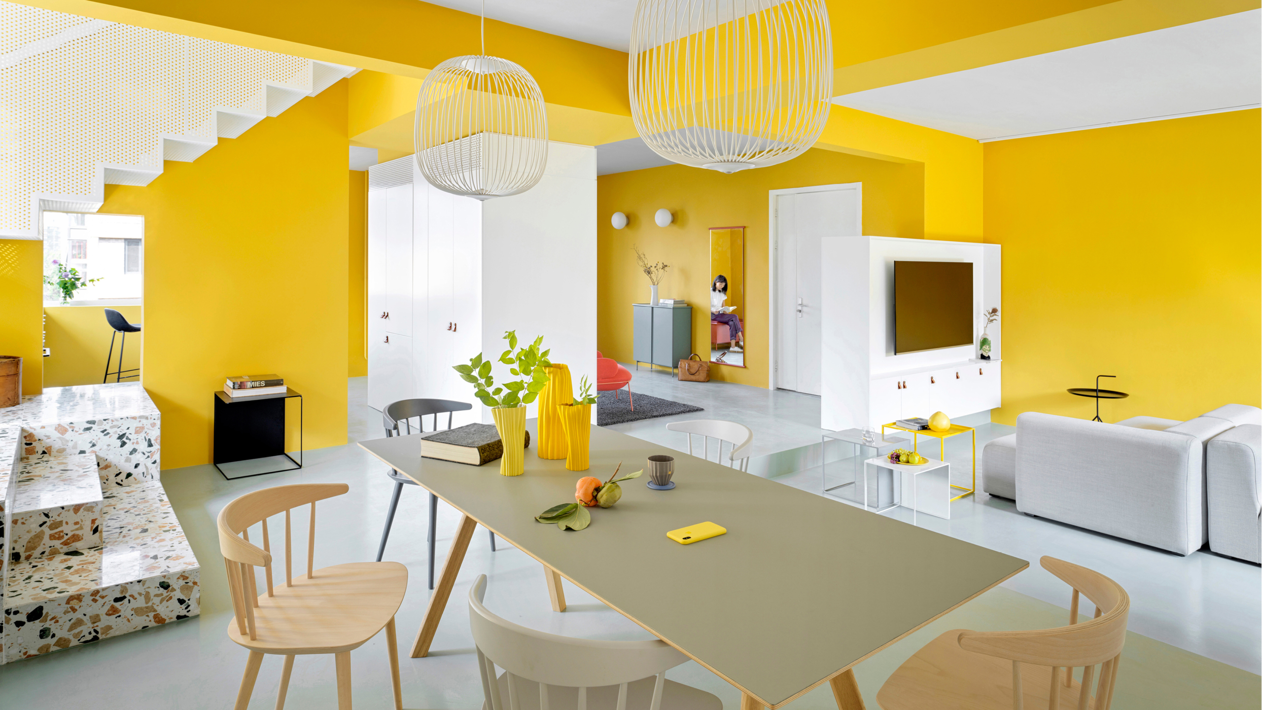


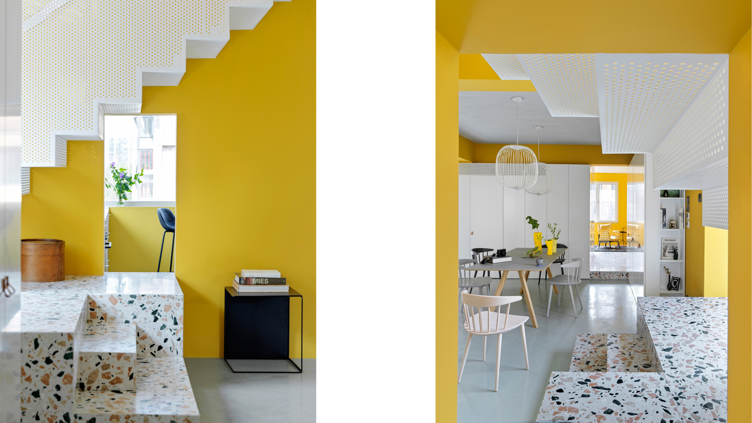


RESIDENTIAL | 2019 | BEIJING | CHINA
DEZEEN AWARDS
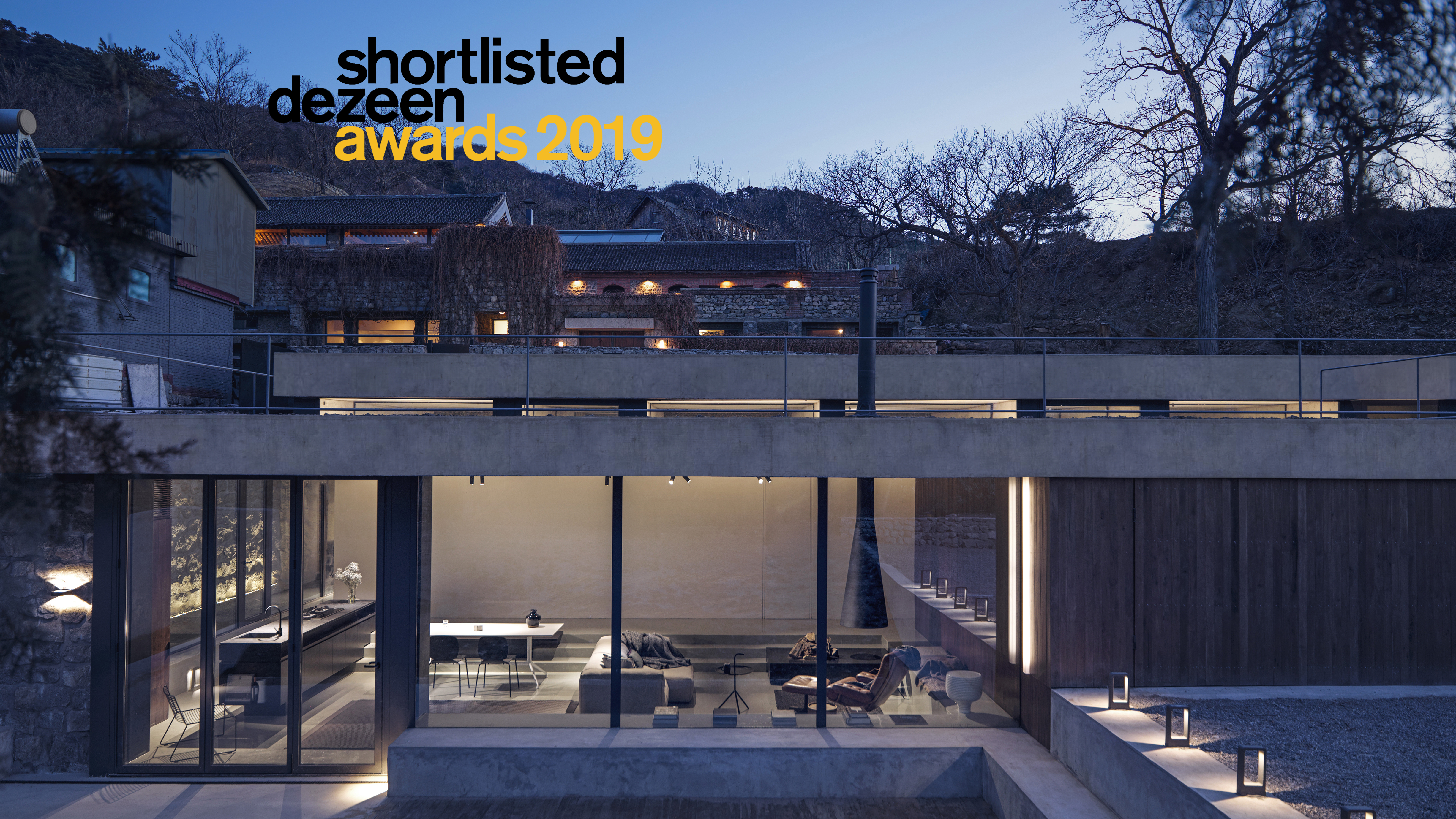
MDDM STUDIO HAS BEEN INCLUDED FOR ARCHITECTURE SHORTLIST FOR DEZEEN AWARDS 2019 | LONDON | UK
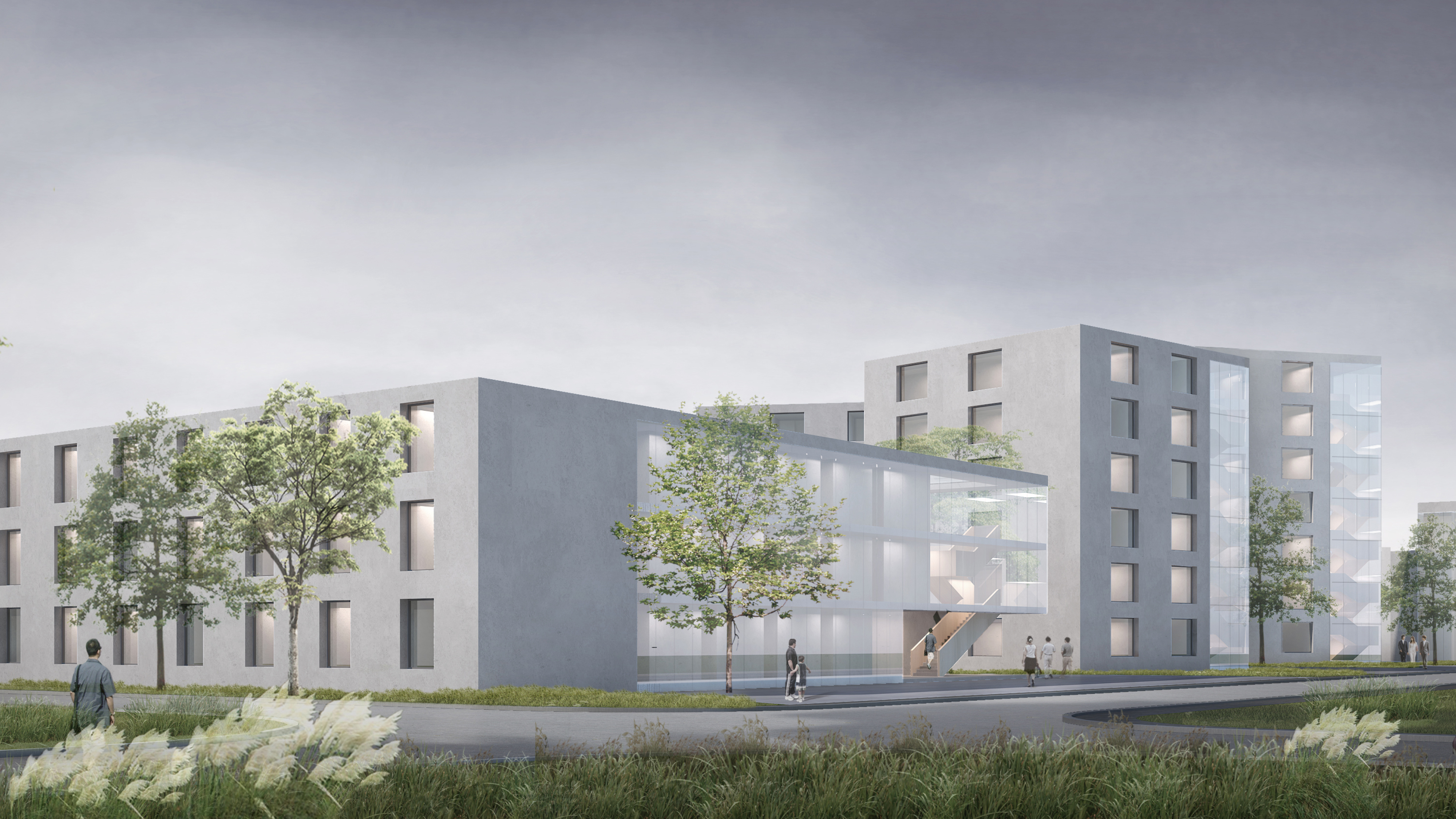
LIDU CO-LIVING


CO-LIVING | 2019 | BEIJING | CHINA
AD100 AWARDS
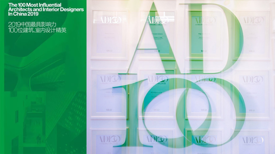


MDDM STUDIO HAS BEEN SELECTED AMONG THE 100 MOST INFLUENTIAL ARCHITECTS AND INTERIOR DESIGNERS IN CHINA 2019 | SHANGHAI | CHINA
ICONIC AWARDS | 2018


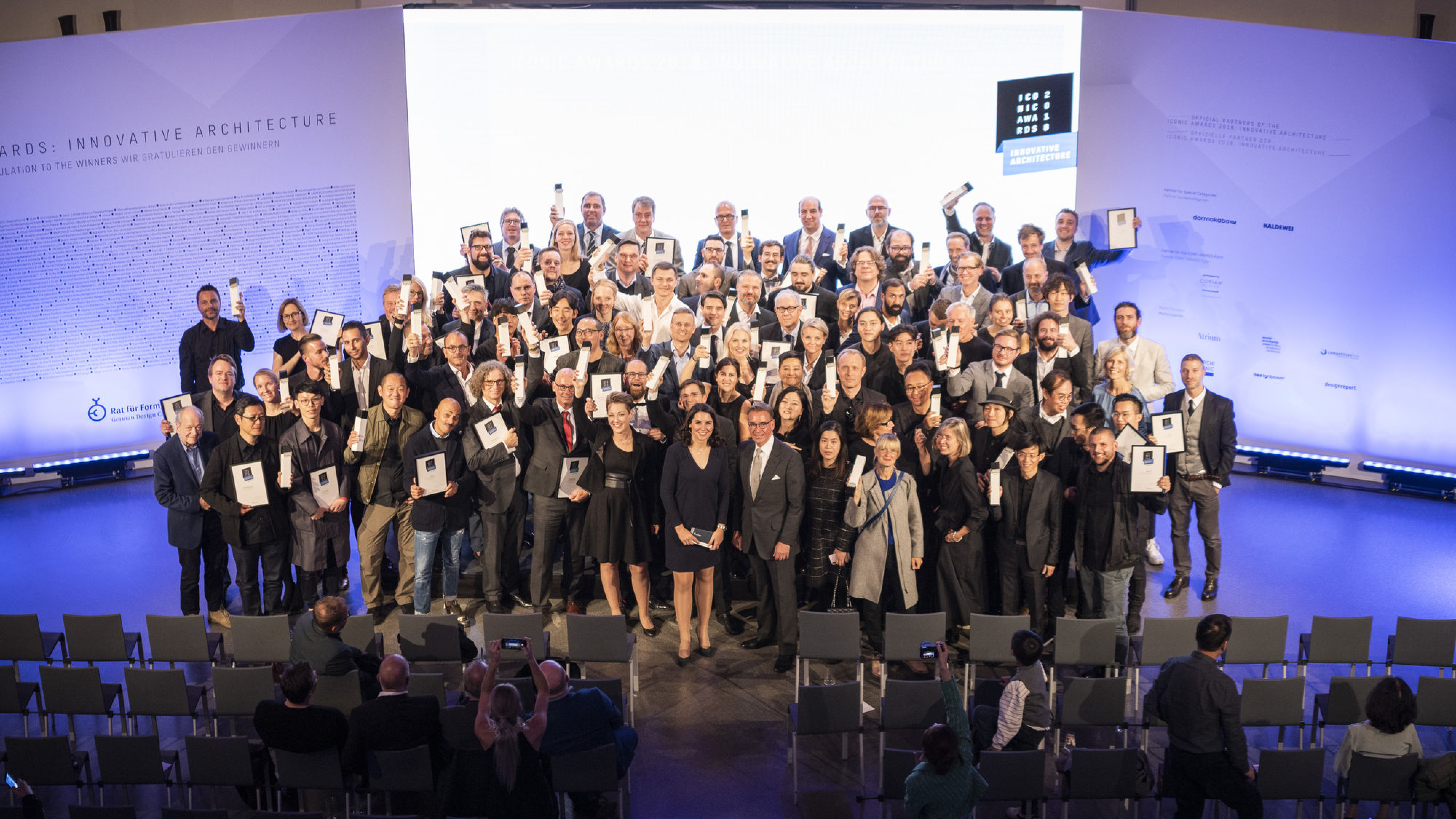
MDDM STUDIO WON BEST OF BEST INNOVATIVE ARCHITECTURE | MUNICH | GERMANY
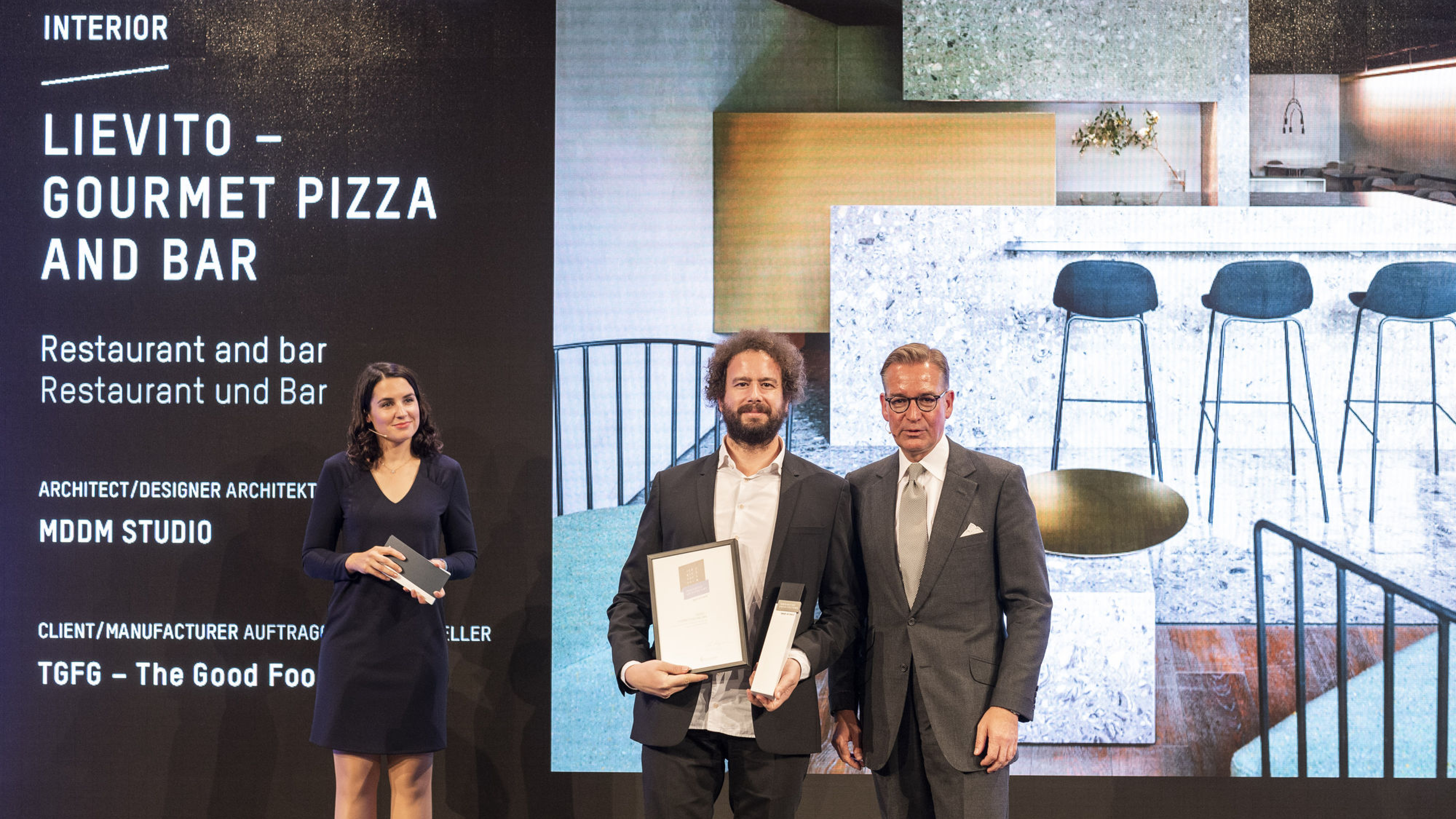
LIEVITO

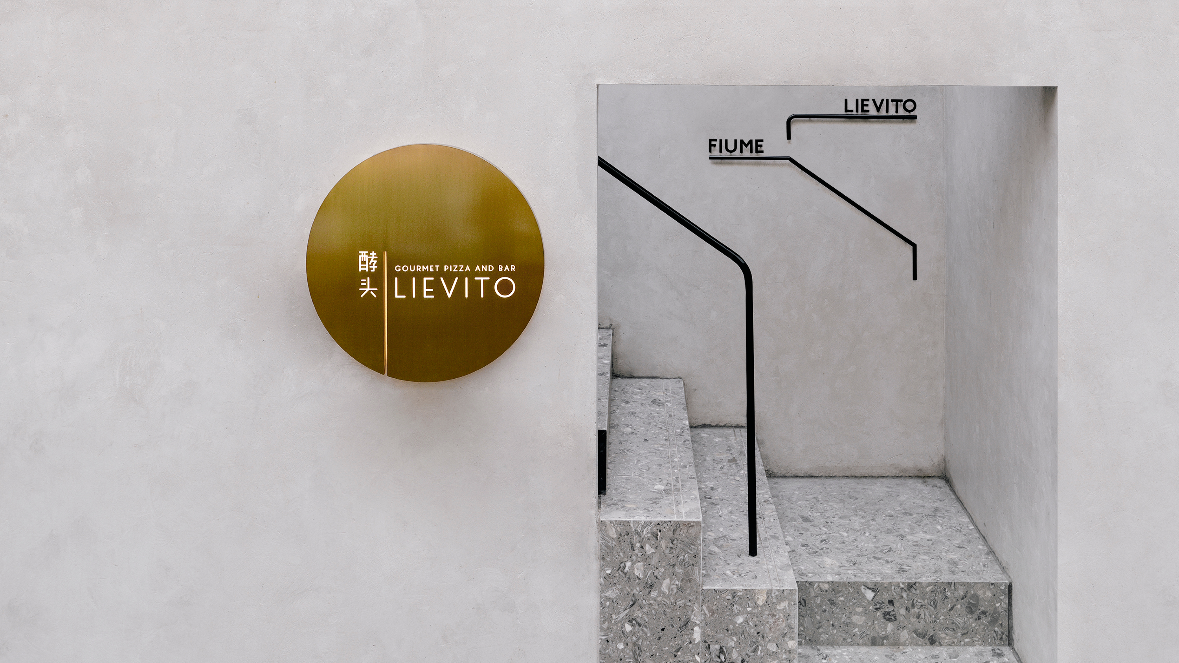


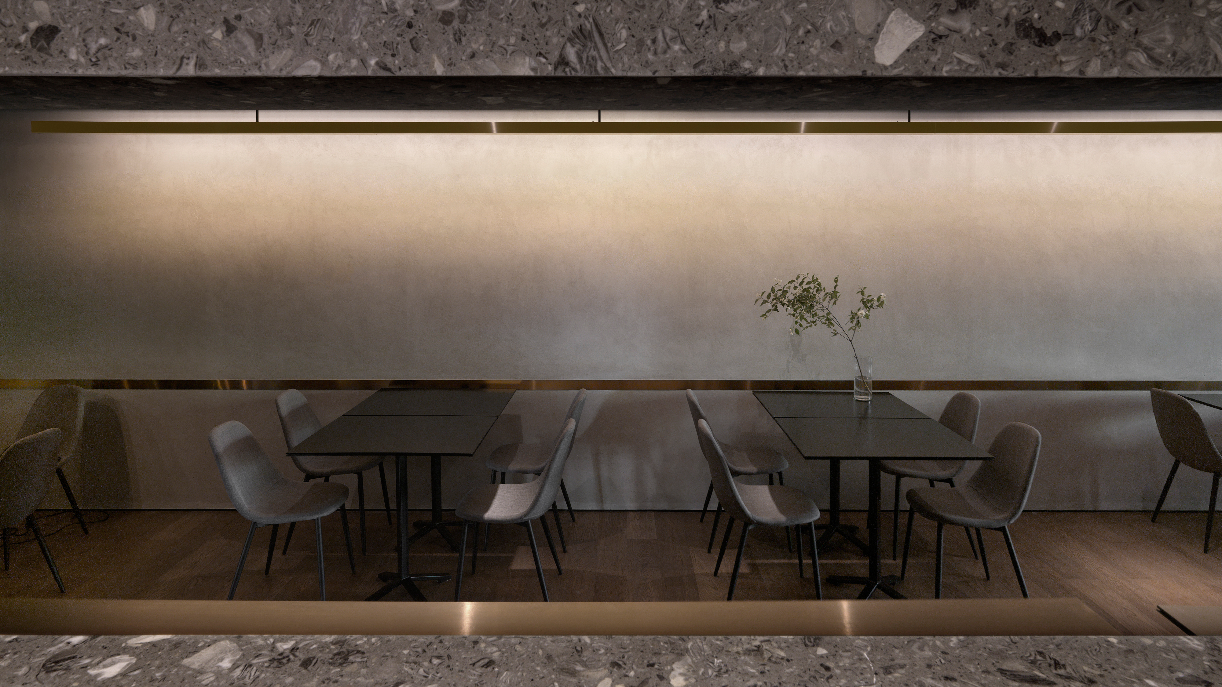
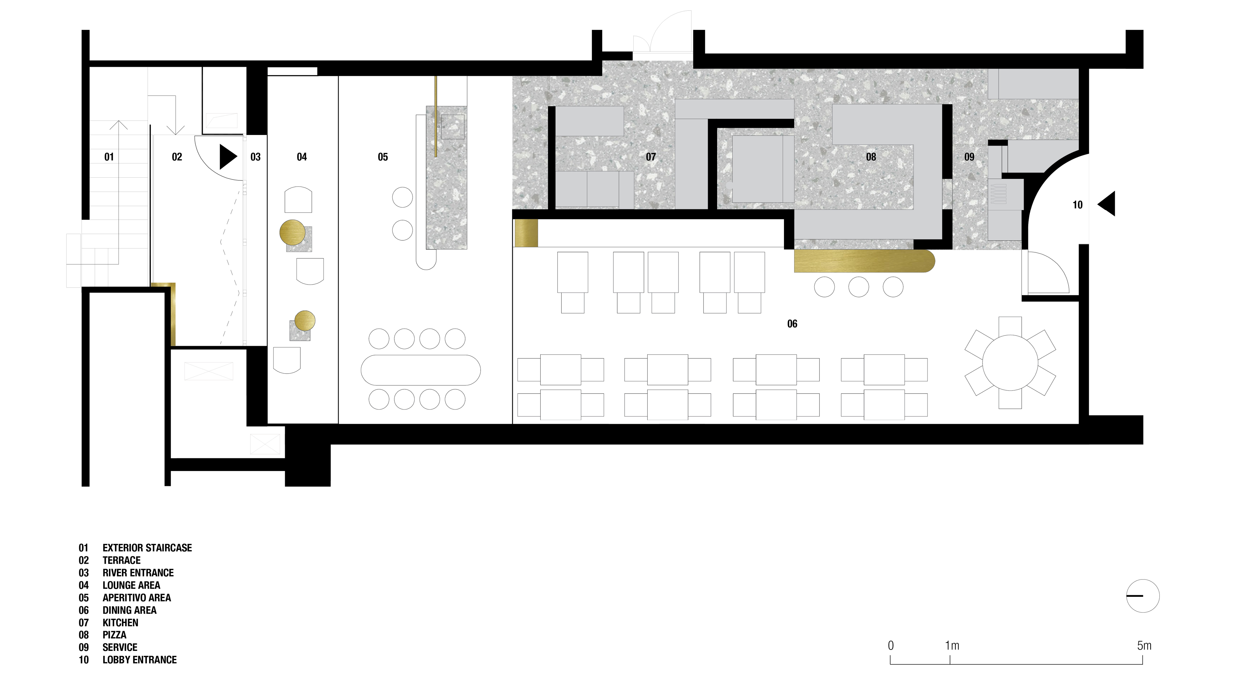
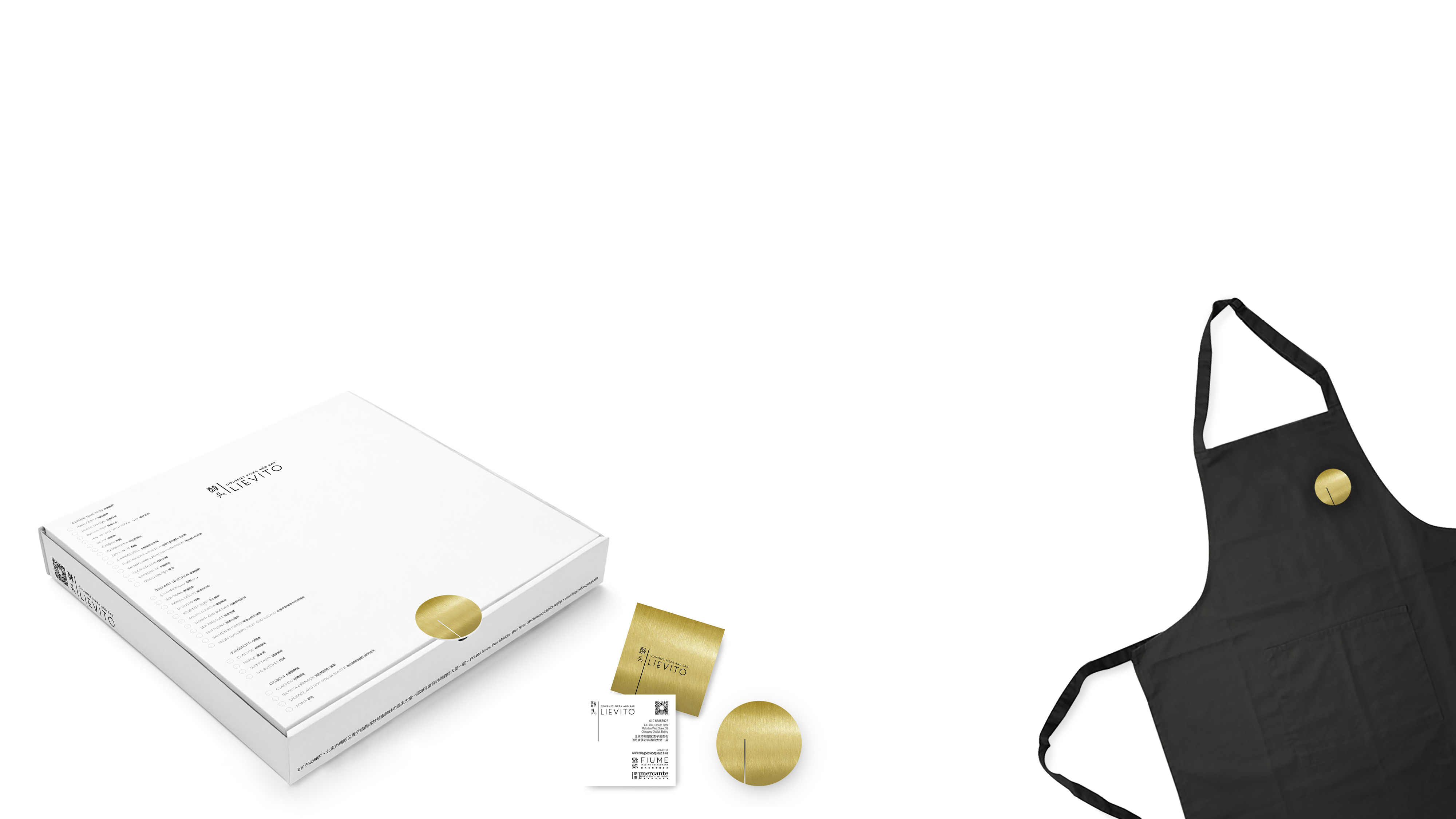

RESTAURANT & BAR | 2017 | BEIJING | CHINA
ORDOS


CAMPUS COMPETITION | FIRST PRIZE | 2017 | ORDOS | CHINA
PRINCIPLE M


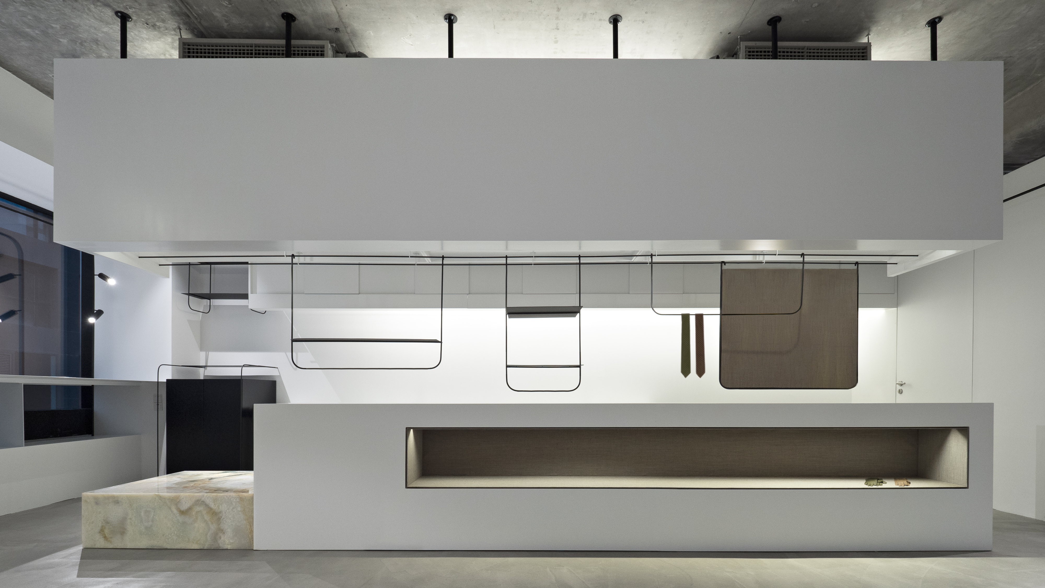


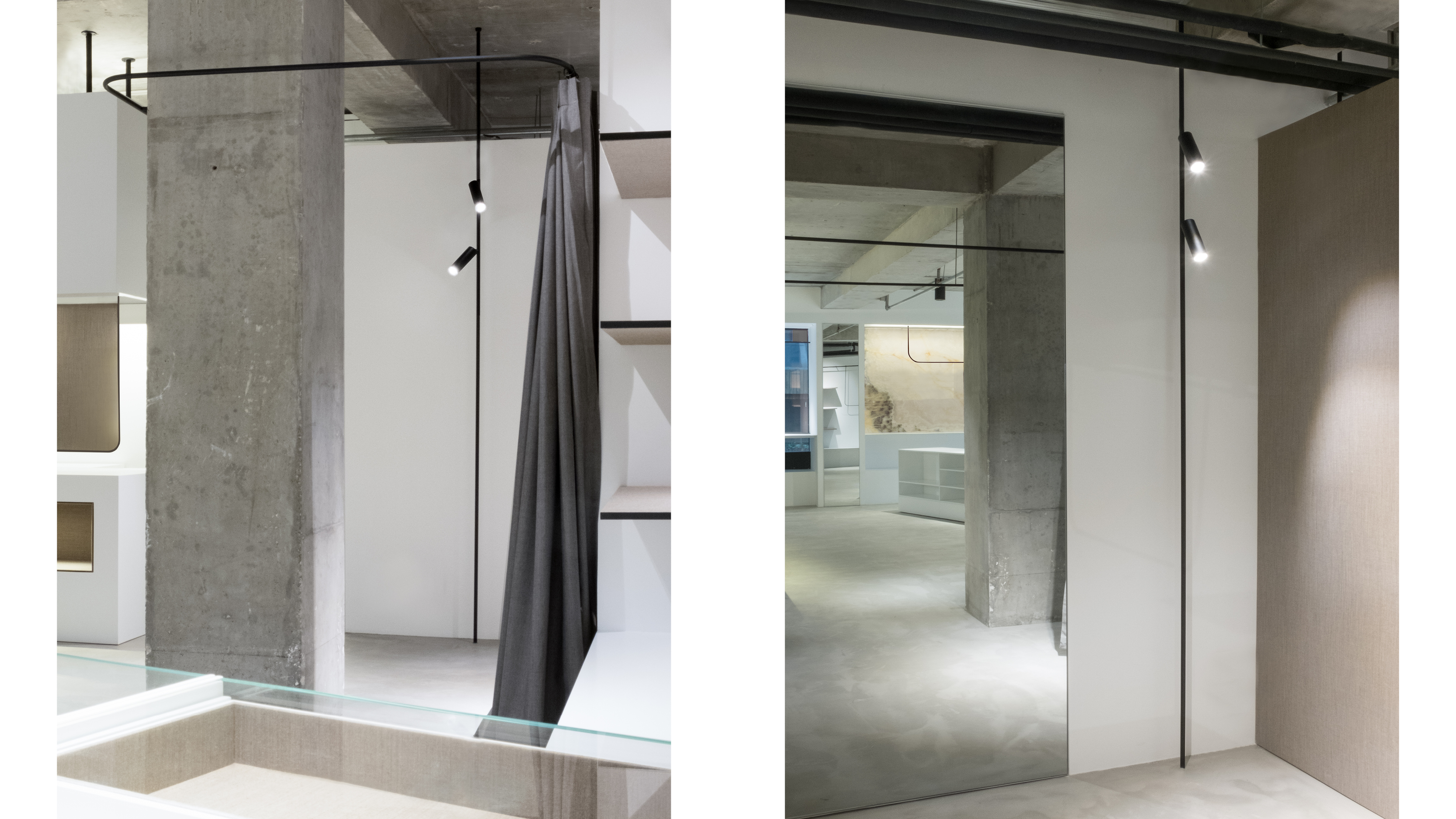
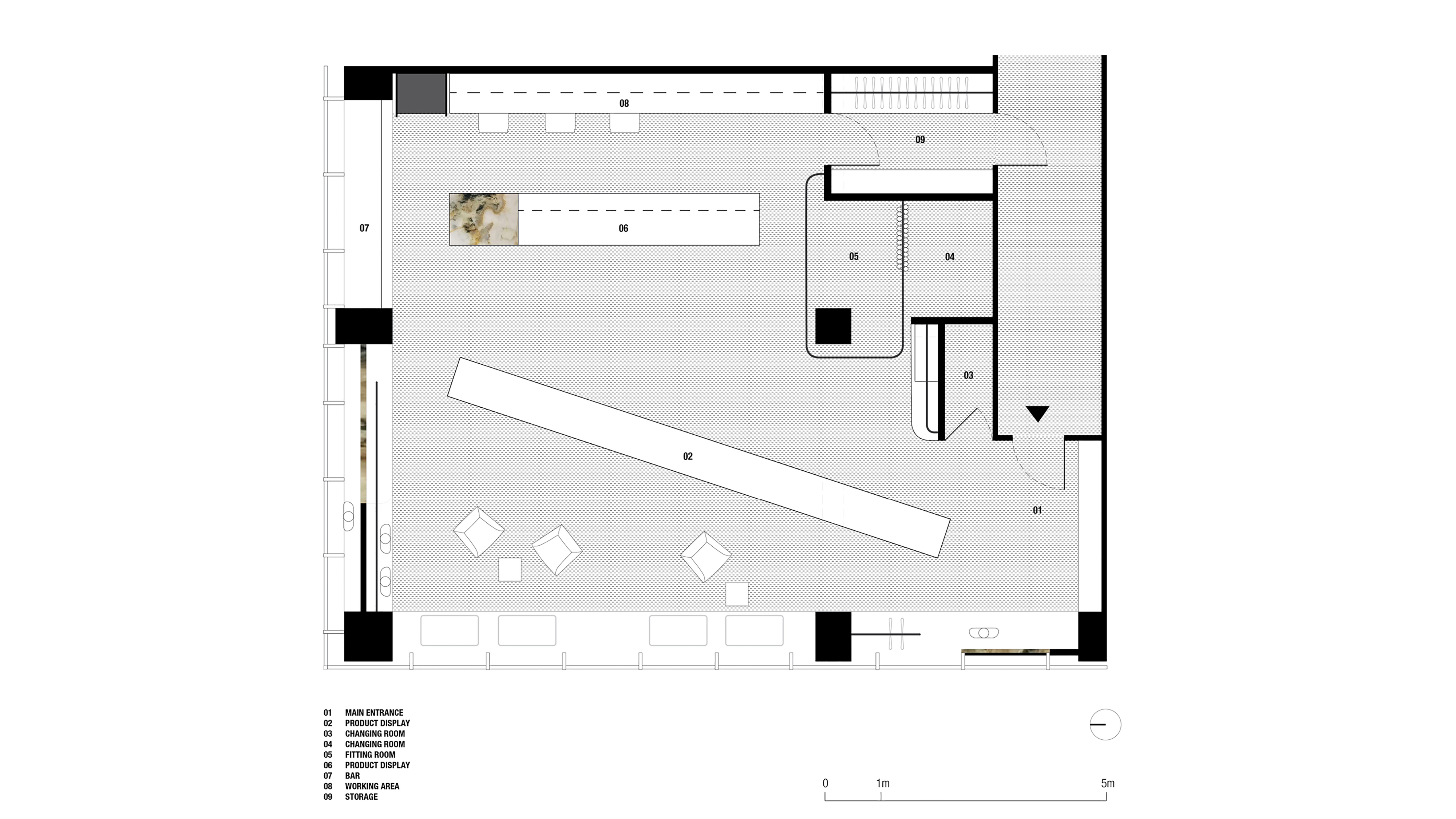
SHOWROOM | 2017 | BEIJING | CHINA
ICE OFFICE


OFFICE | 2017 | BEIJING | CHINA
BRUNECK CANTEEN


COMPETITION | SECOND PRIZE | 2014 | BRUNECK | ITALY
SECRET GARDEN


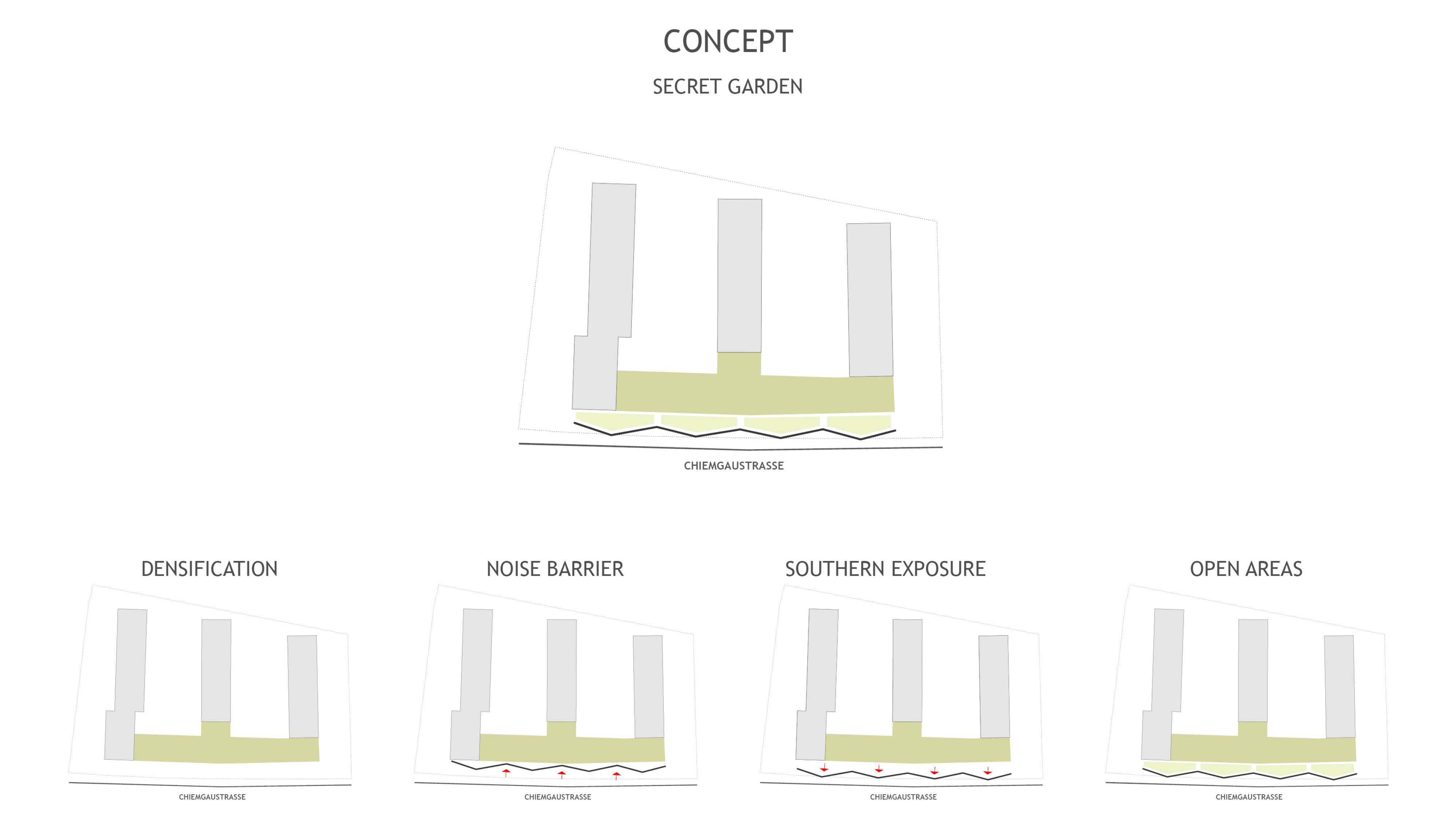


RESIDENTIAL | 2013 | MUNICH | GERMANY
BUNDESRAT


COMPETITION | 2014 | BERLIN | GERMANY
GRAPE GARDEN


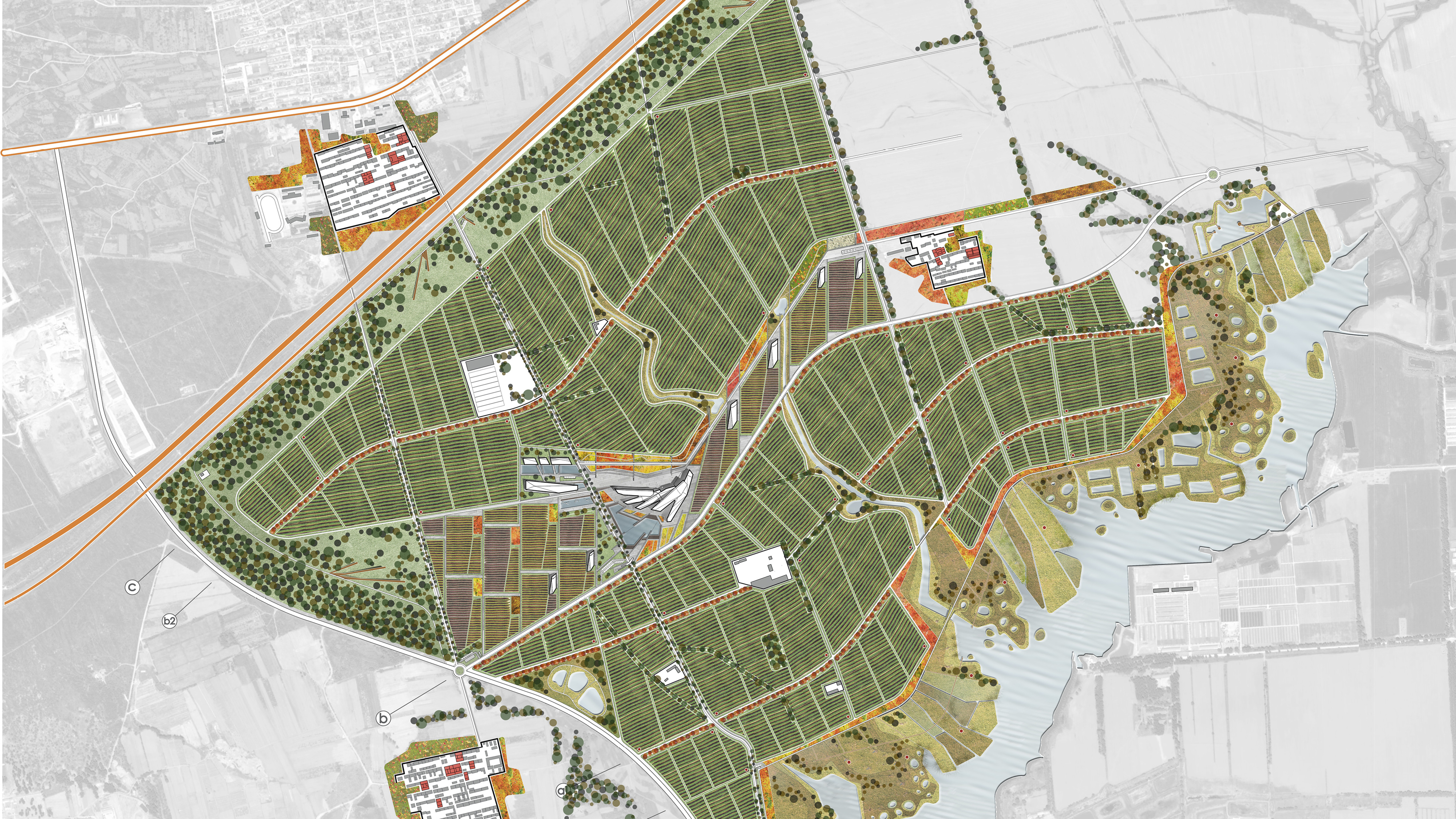


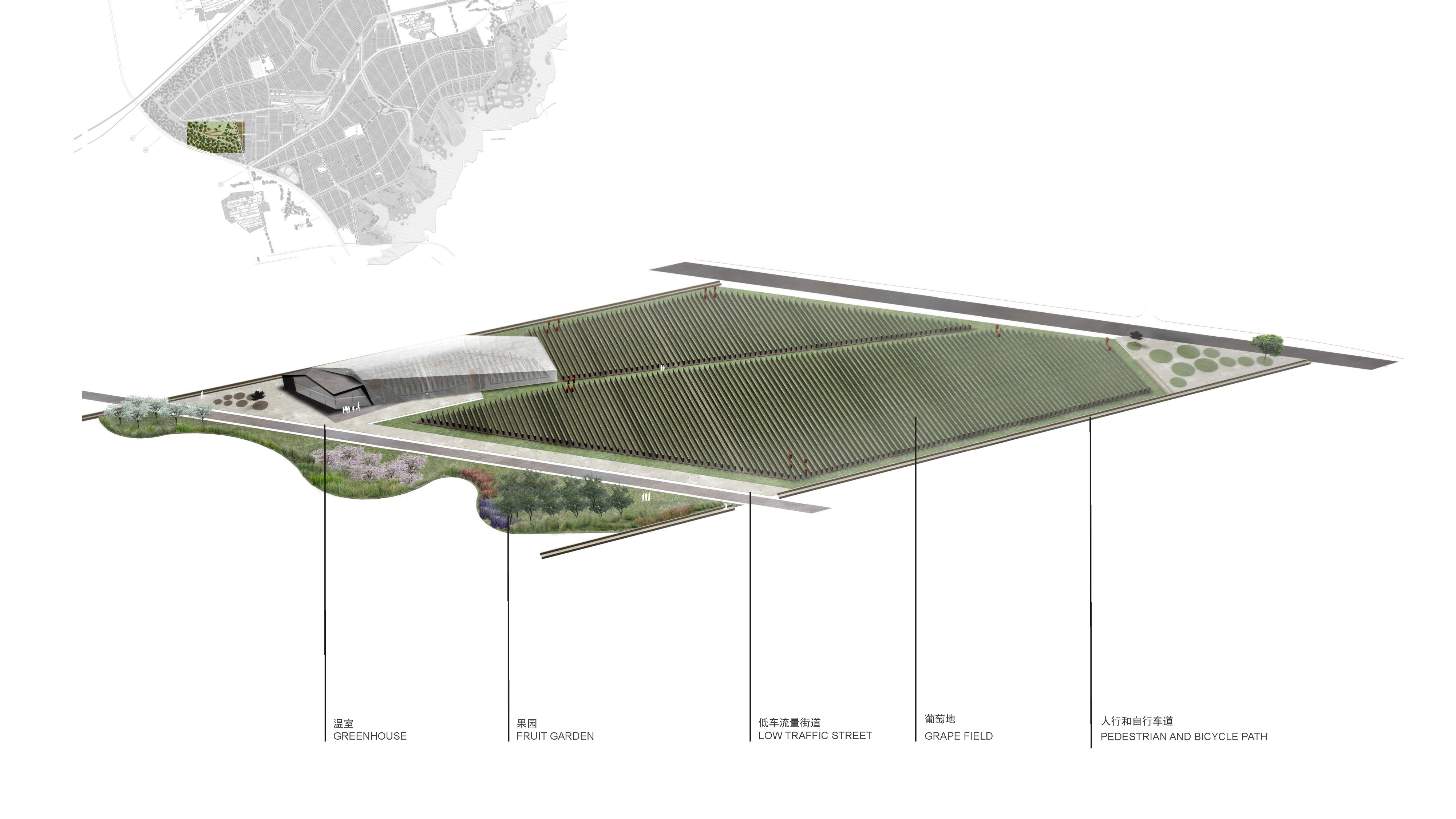

COMPETITION | FIRST PRIZE | 2012 | YANQING | CHINA
Awards
-
AIIDA
Gold Prize for Villa | House HD | China | 2022
-
AIIDA
Silver prize for Office | UMPG I China | 2022
-
DFA Design For Asia
Silver Prize for Architecture | House on the Great Wall I HongKong I 2019
-
Driven x Design 2019
Silver Prize for Hospitality | Lievito I Shanghai I China I 2019
-
Dezeen awards 2019
Shortlisted for Architecture | House on the Great Wall I UK I 2019
-
AD 100
Architectural Digest 100 most influential architects and interior designers in China | 2019
-
Elle Decor
Design book of China | 2019
-
10 Chinese Interior Design Worth Knowing About
Selected by dezeen.com | 2019
-
5 Stagioni
Honorable Mention | Italy | 2019
-
Iconic awards: Innovative Architecture 2018
Best of Best in Hospitality Category by the German Design Council | Germany | 2018
-
20 Promising Young Design Offices in China
Selected by gooood.hk | 2017
-
Young Italian Architects Award
3rd Prize | Italy | 2012
Publications
-
House of Joy
2022/04 | Germany
-
Neighborhood Facility Vol 6
2022/1 | Korea
-
Architectural Digest
2021/12 | China
-
INTERNI & Decor
2021/11 | China
-
Mini Building
2021/06 | Korea
-
Interiors 405
2020/06 | Korea
-
AIT Wohnen
2019/7-8 | Germany
-
Elle Decor China Interior Design Annual 2019
2019/01 | China
-
Artravel
PAGE 88 | France
-
Architectural Digest
2018/01 | China
-
Frame Magazine
2018/01-02 | Netherlands
-
Bob Magazine
2018/02 | Korea
-
Elle Decor
2017/10 | China
-
Architetture Architetti Pistoiese 1981 - 1961
PAGE 100/102 | Italy
-
Architetture Architetti Pistoiese 1981 - 1961
PAGE 71/73 | Italy
-
Creative Diagram in Landscape & Planning
2013/1 | China
-
gooood.hk
-
dezeen.com
-
archdaily.com
-
frameweb.com
-
baunetz.de
-
elledecor.com/it
-
admagazine.ru
-
thegreataddress.com
-
naver.com
-
aarbmagazine.ru
-
designwire.com.cn
-
archello.com
ABOUT
MDDM Studio
Is an architectural firm based in Beijing and Berlin founded by Margret Domko and Momo Andrea Destro.
Contact
For information, job application or project enquiries please leave us a message:
